As part of this assignment, I will create a logotype for a business, combining text, typography, shapes, and colors to establish its visual identity. Using pen and paper, I will develop logo drafts and associated symbols based on the assigned branch, theme, and location. The name for my company is Högströms Veganska.
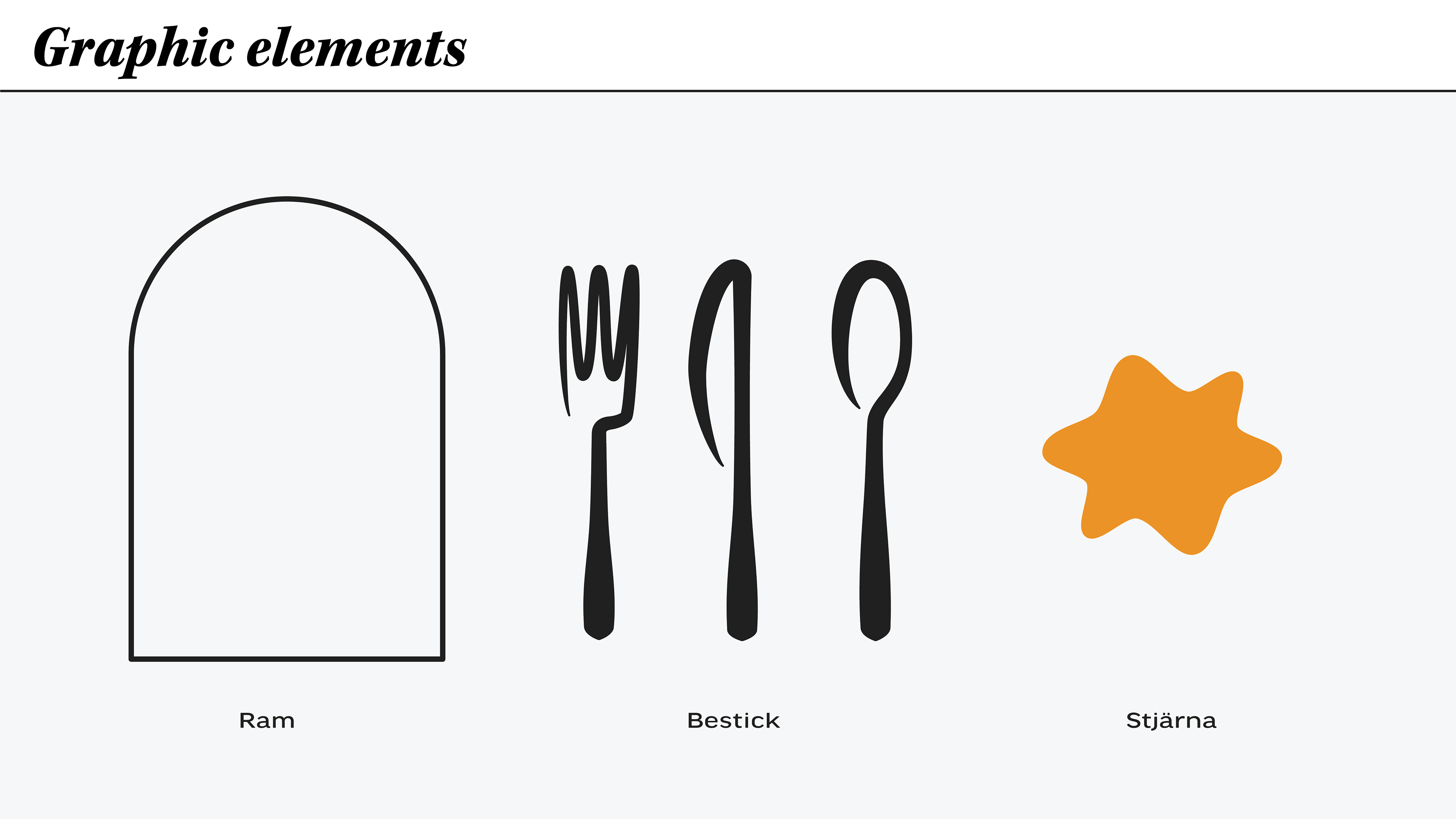
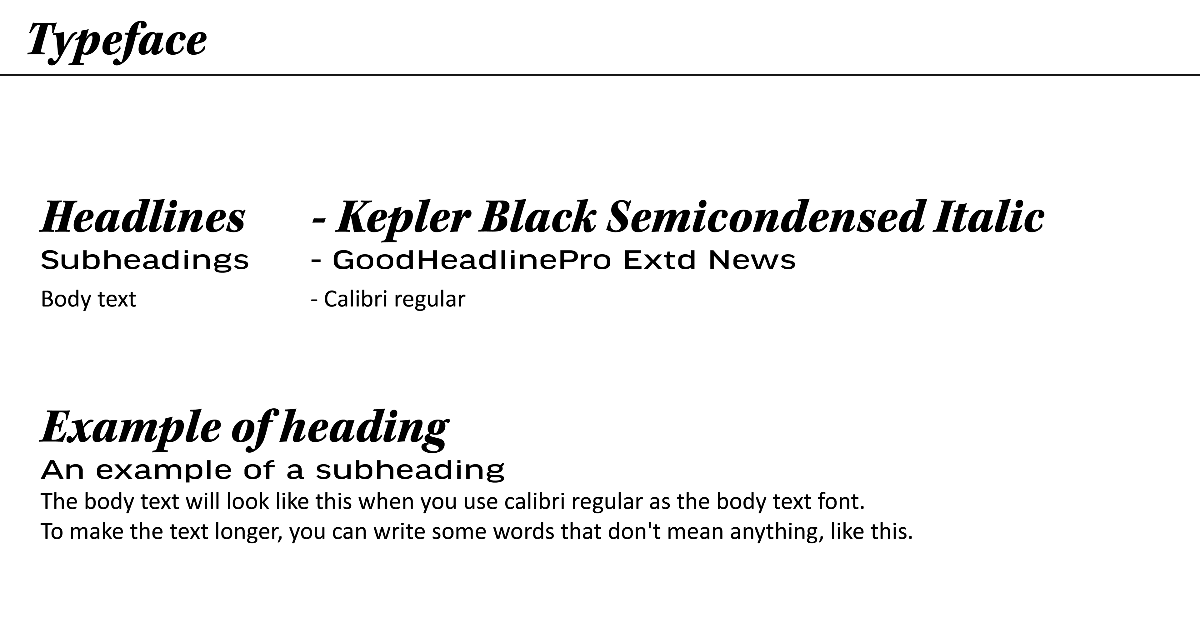
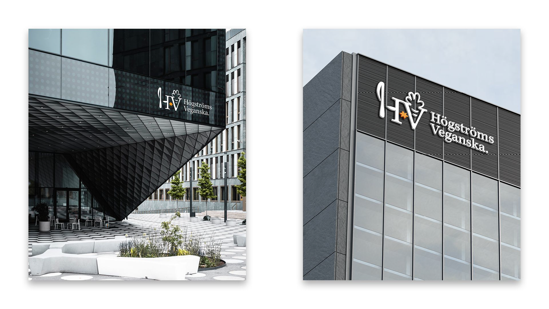
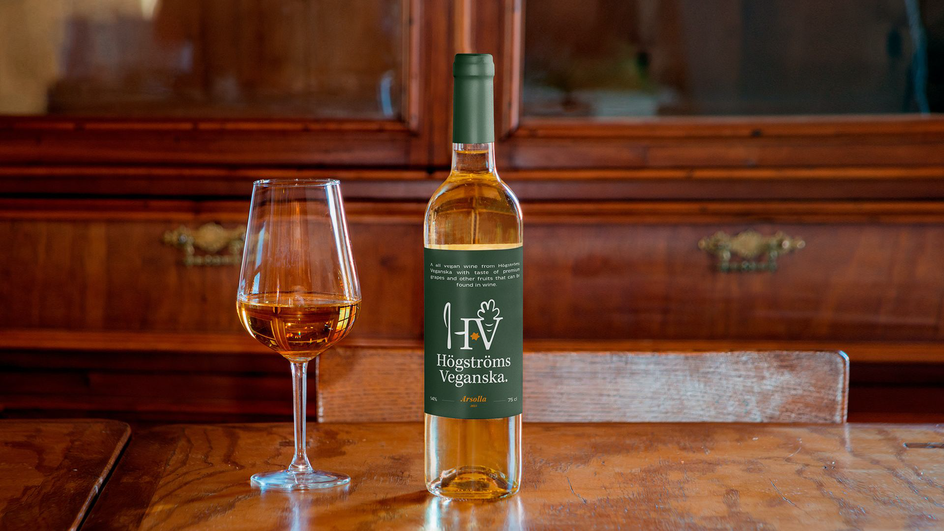
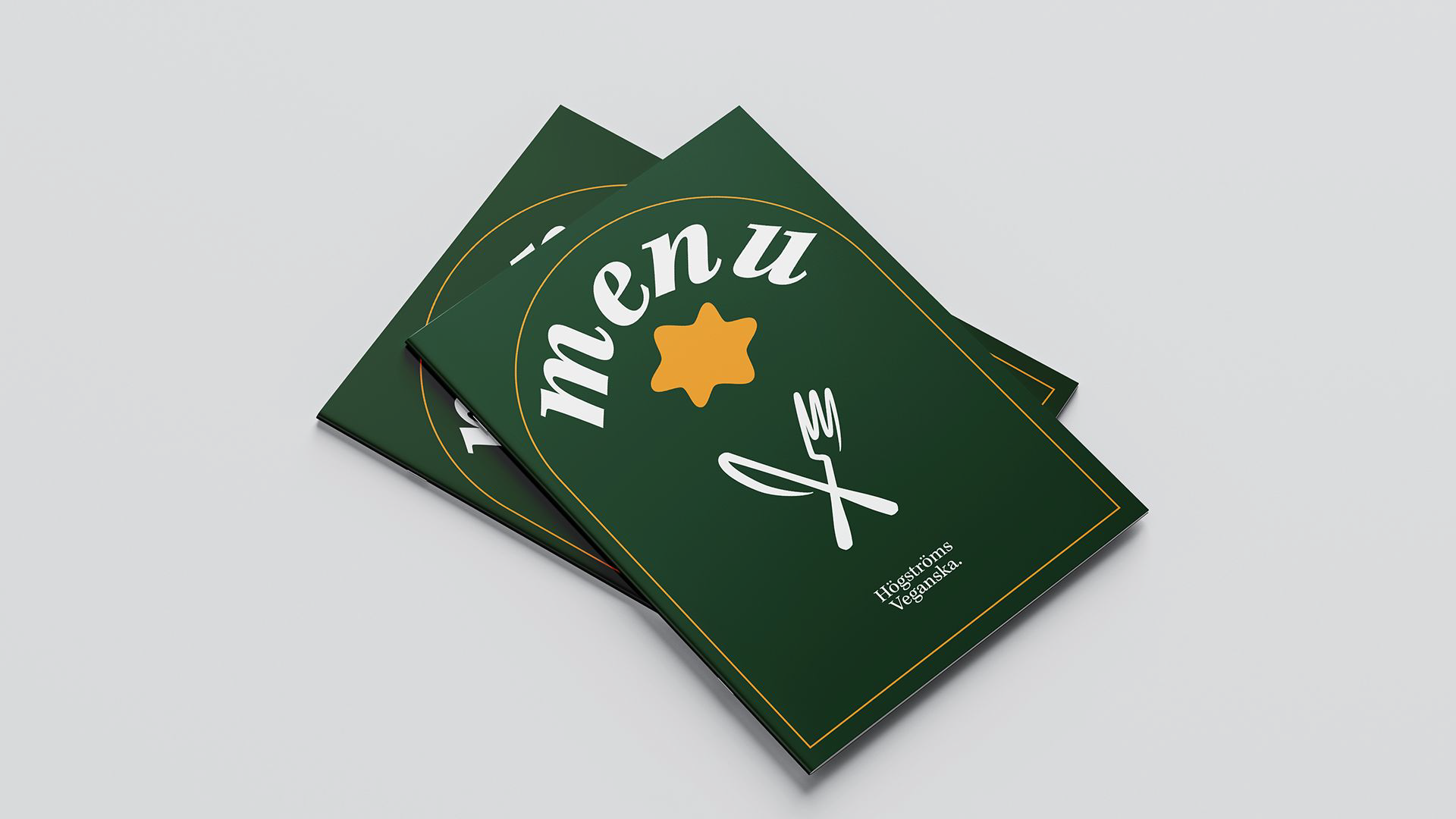
The next assignment is to create a event poster for the logotype that suits the restaurant with a fitting event. After the poster and logotype design a graphic profile was to be made. To make the graphic profile I collected the typography from the poster and logo and some of the graphic elements. I also made some mockups that shows the logo and its graphic elements in context.
Logotype design
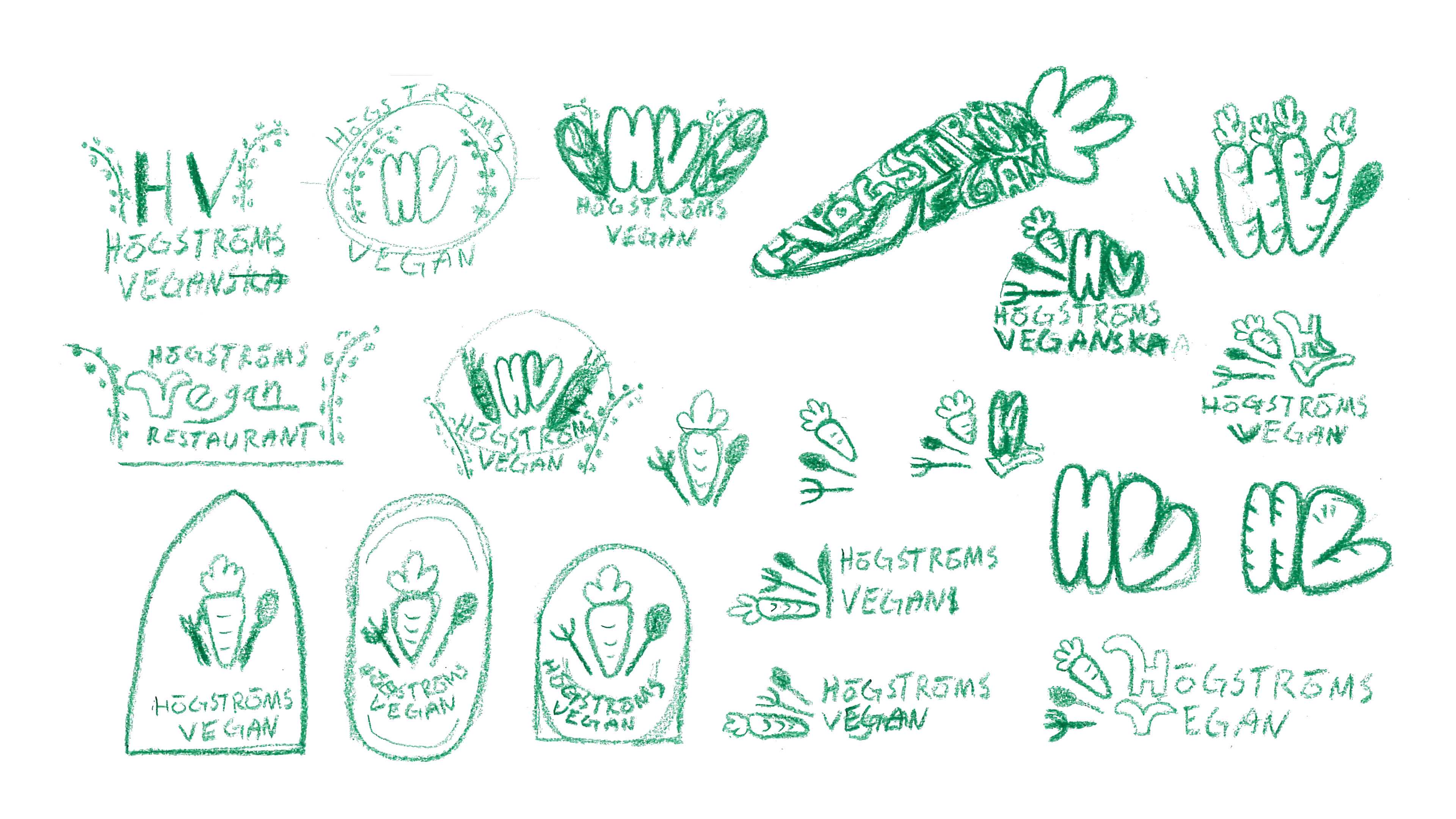
First sketches
The first sketches I made turned out pretty well and I stuck with the rounded HV which I thought reflected my vision of a hip restaurant with vegan food. I then developed all these sketches further in Illustrator, which I hadn't worked much in before. It was a lot of fun to learn a new graphic program.

Sketch digitization
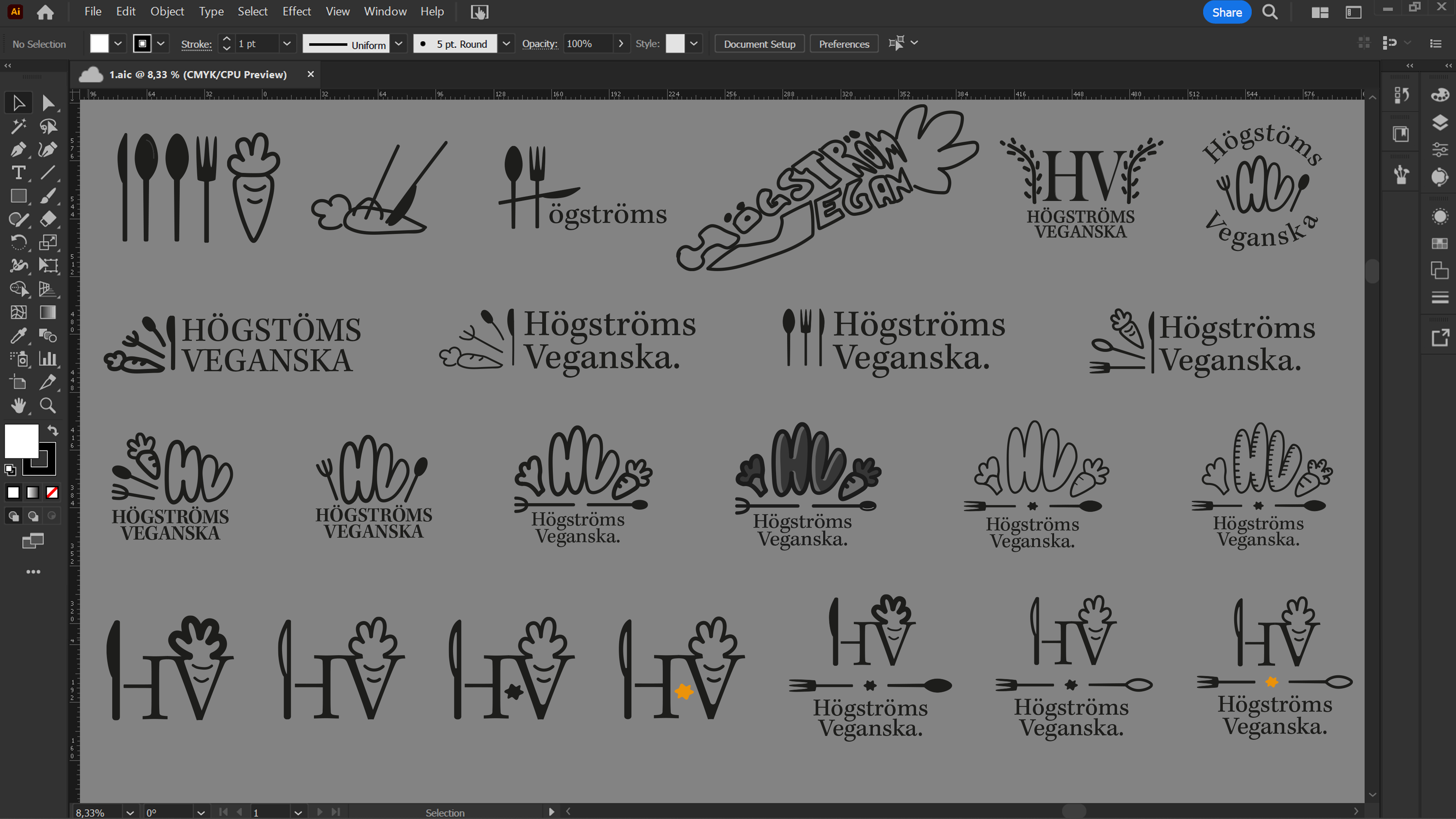
In Illustrator, I developed the sketches even more and moved away from HV with the rounded corners and instead switched to a more elegant logo with thinner lines. I did that partly because the restaurant should be in a premium price range and the rounded HV logos felt a little too childish. I added the yellow color to give the logo a little more color and catch the observer, the fact that it became a star also has something to do with the premium feeling.
First logo koncept
I made a dark and light version of the first logo concept and showed a feedback pass and received as feedback that there were a lot of parts in the logo, especially the fork and the spoon. The line thickness was also something that I took with me to develop.
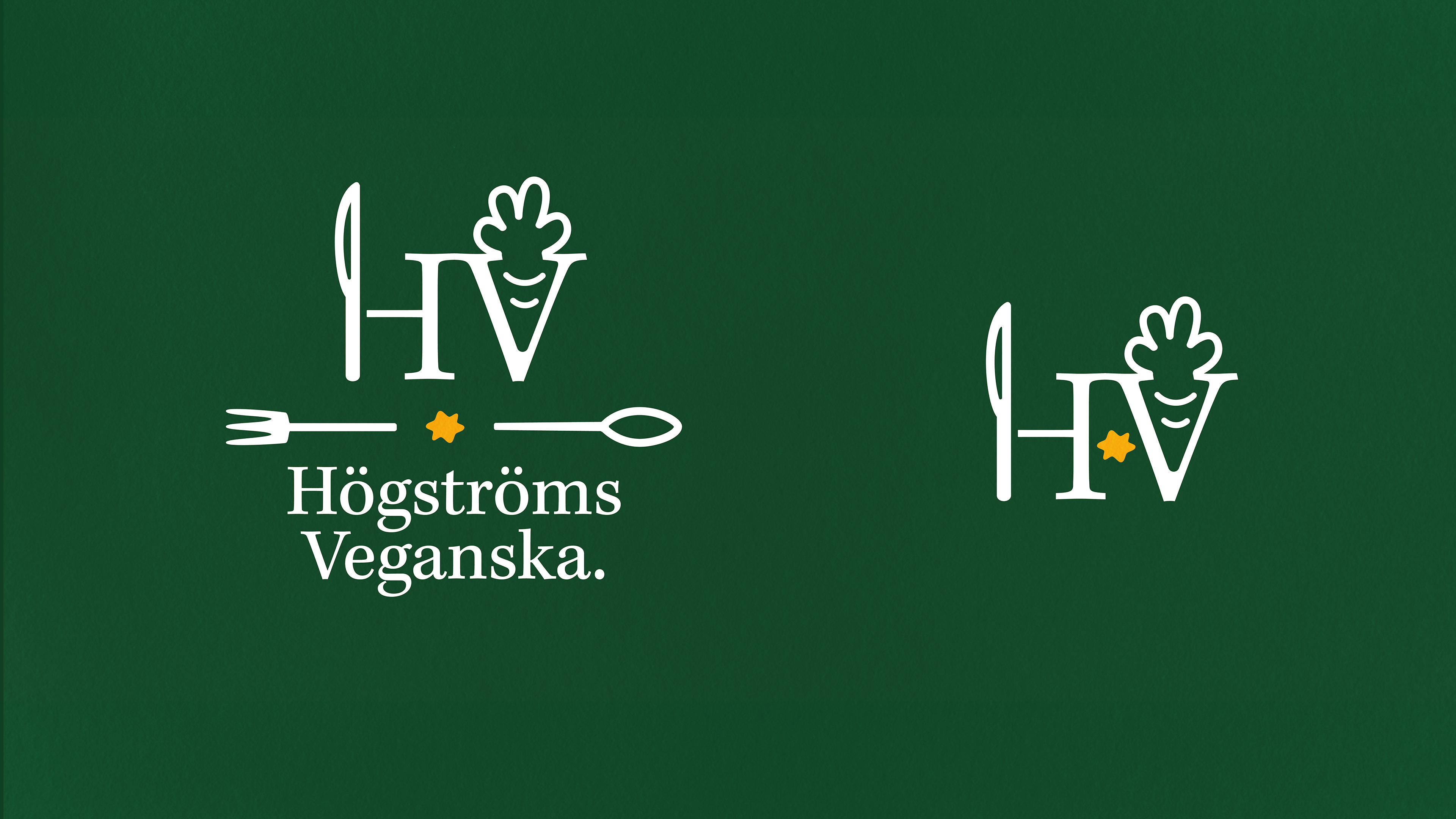
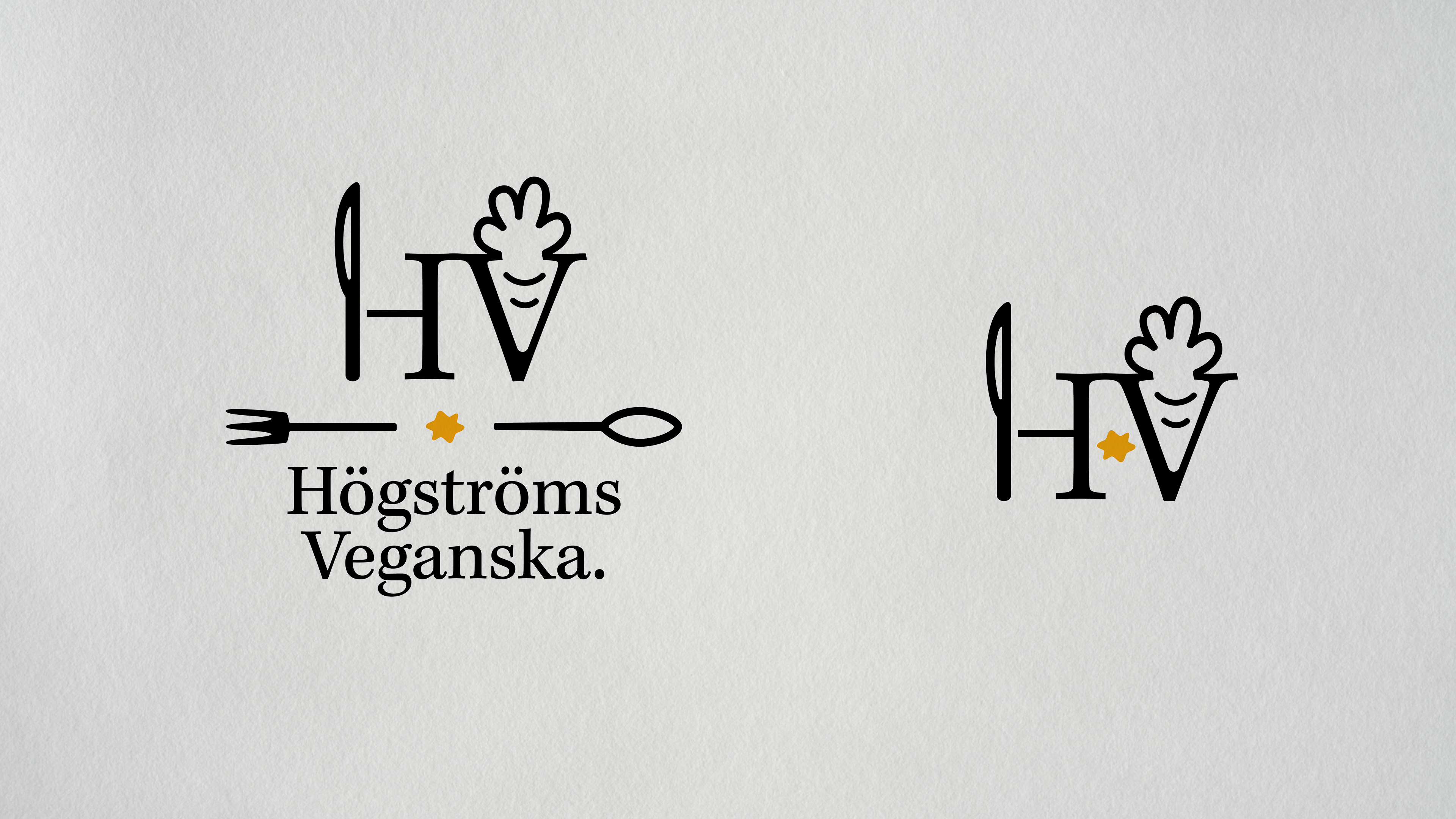
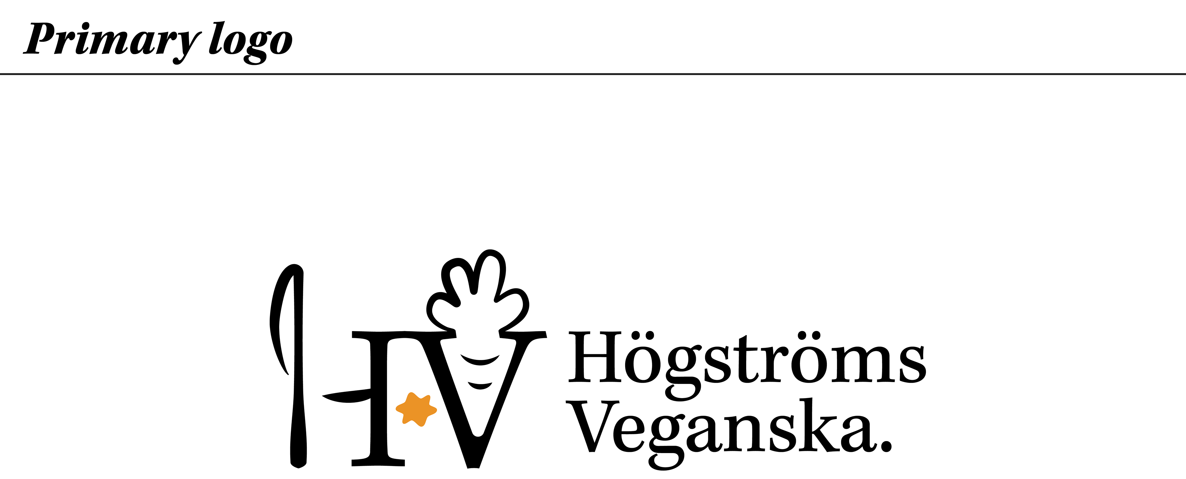
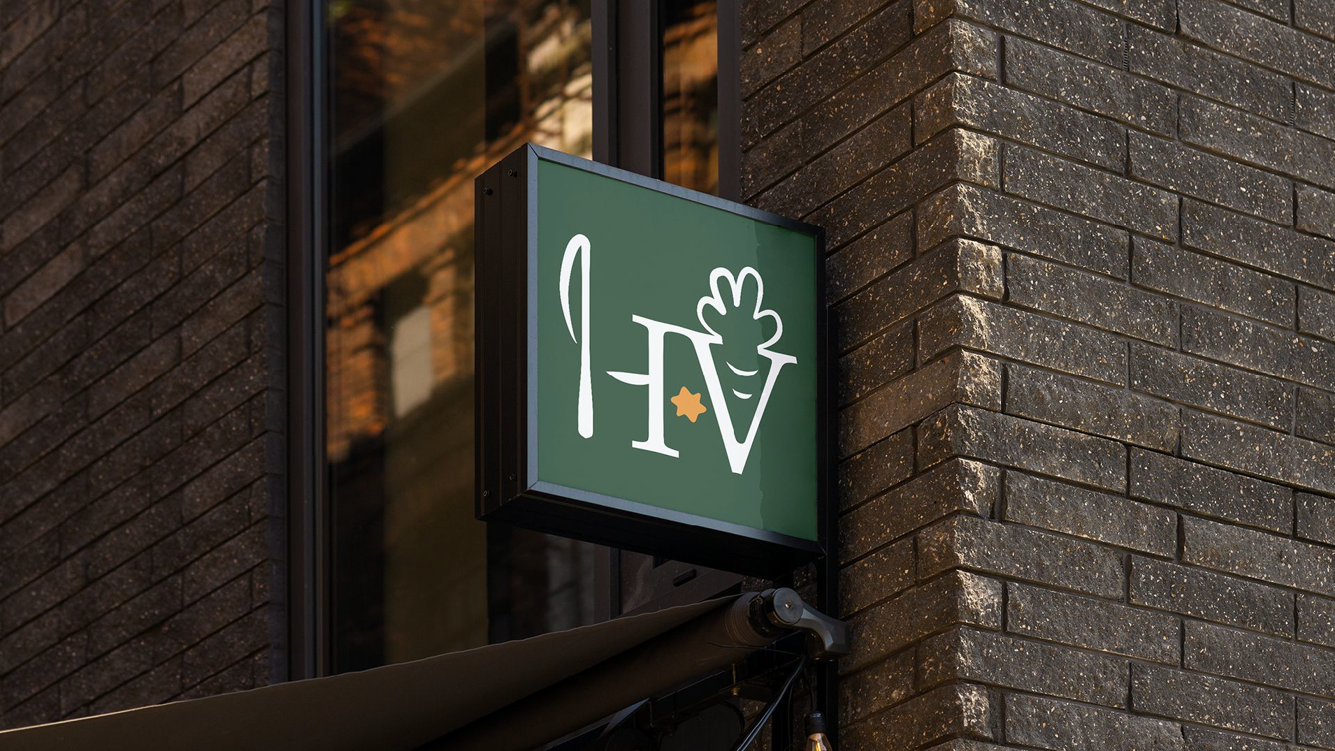
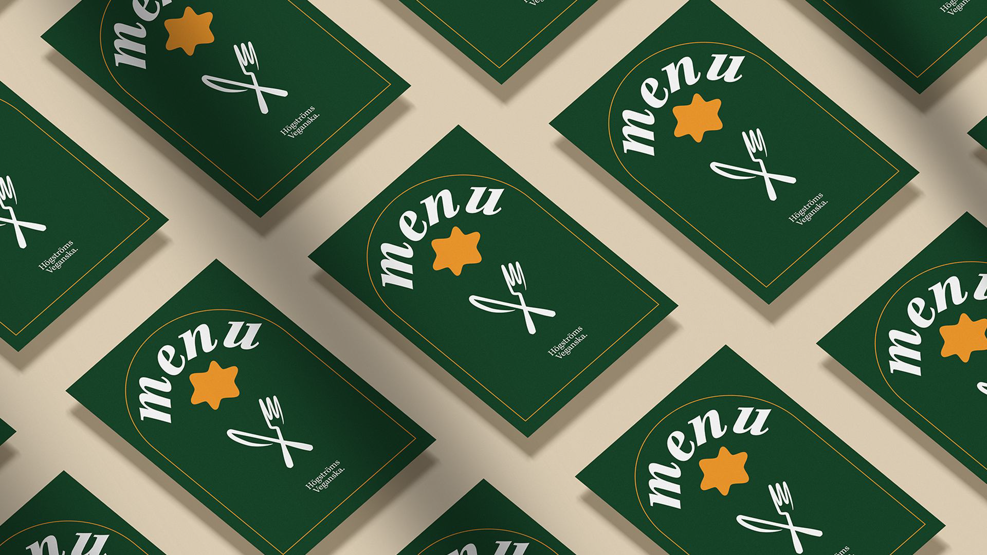
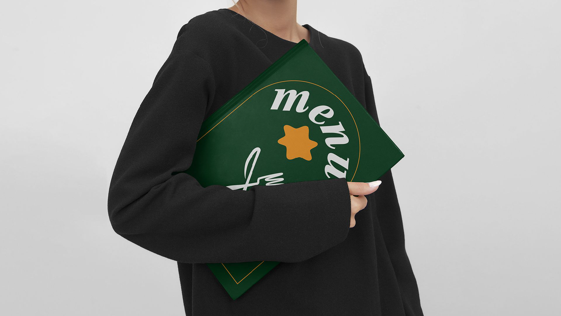
Final logotype
With changed line thickness and a little cleaning in the logo, the final logo was ready. The difference is the line thicknesses and that the fork and spoon have been removed.

Poster design
First koncepts
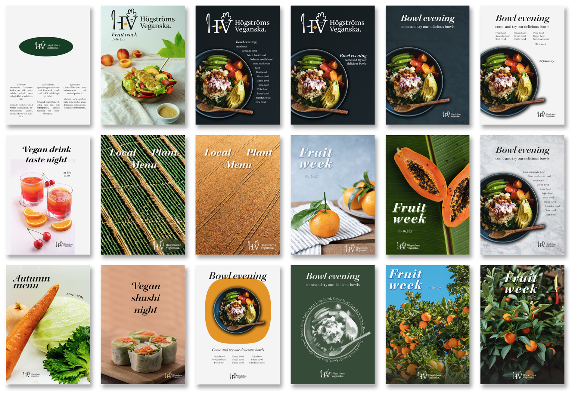
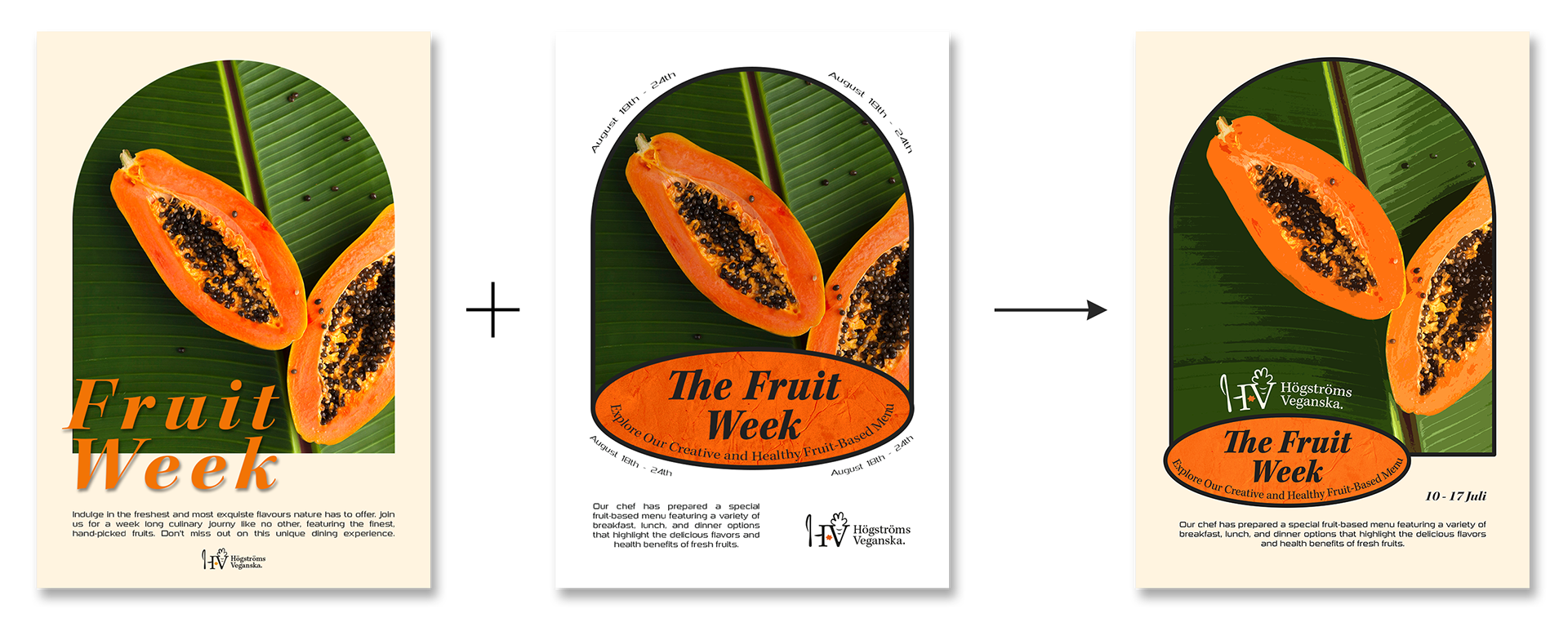
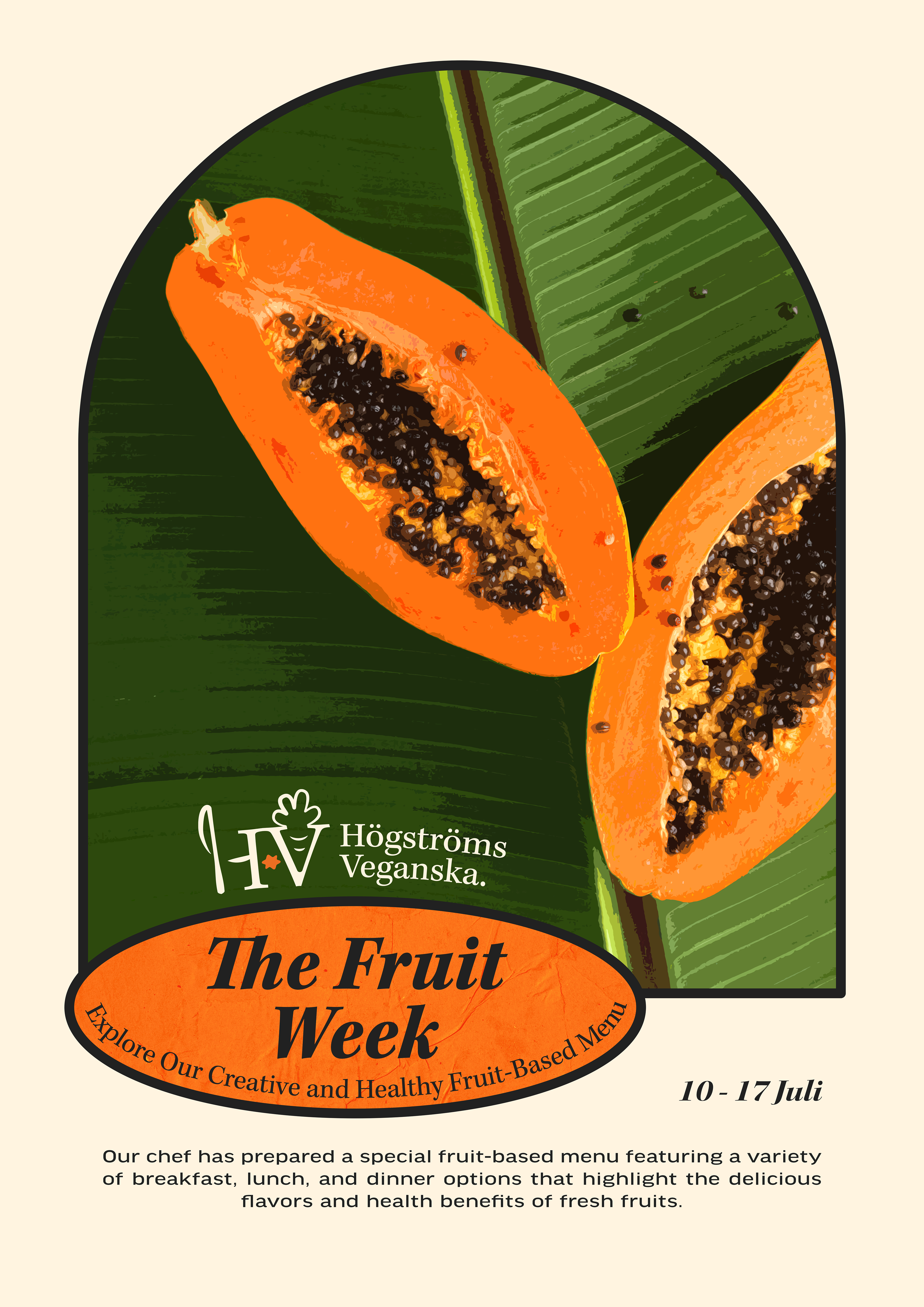
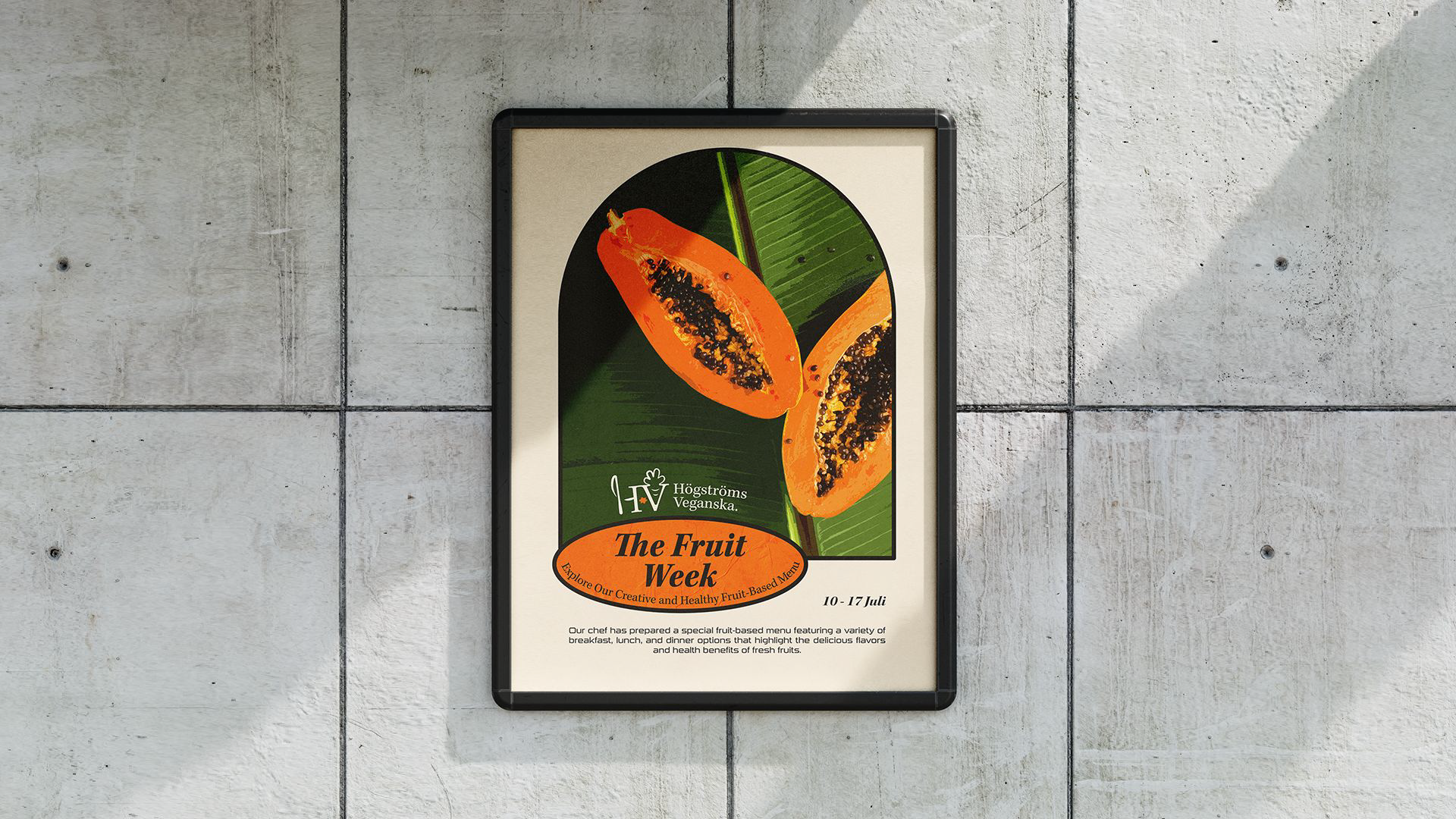
I initially had quite a hard time choosing what kind of posters to make so I made loads and took these to a feedback session where they liked the image with two orange papayas on a green leaf, the other posters felt boring I thought so I worked on with a picture.
Final poster
From the first posters I developed a new concept with a bow and something similar to fruit stickers behind the header. I also adapted the text and fonts in the poster to match the logo and the restaurant's graphic profile which is under development. The resulting poster was printed in A2 and hung up at Luleå University of Technology and I was very happy with it.
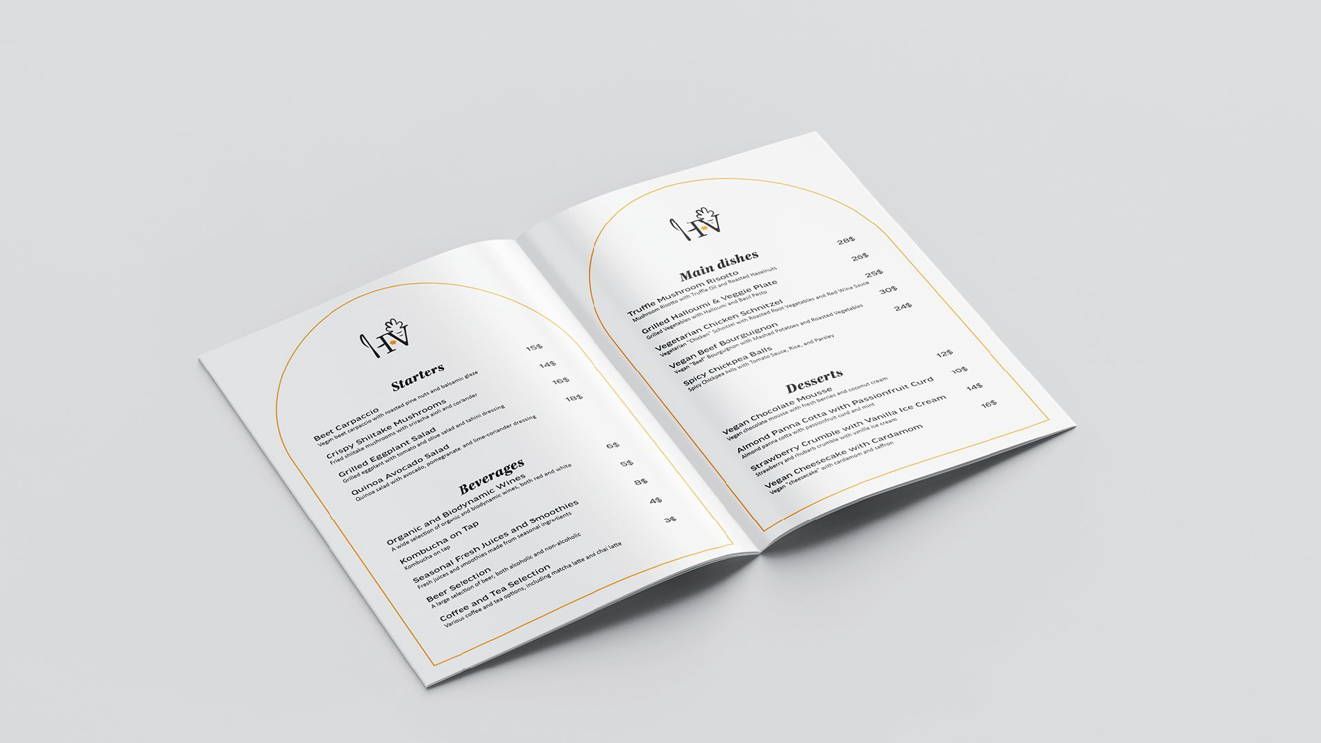
Graphic profile
With a logo and posters ready, it was time for a graphic profile that should contain colors, fonts, the logo, graphic elements and visualizations of how the logo is used.


I think this project has been very interesting and educational. Mainly because I have been able to deepen my skills in the programs Illustrator and Photoshop but also because I have been able to learn how to make logos, information posters, what is included in a graphic profile and to present in a better way.