I carried out a graphic "re-branding" for a local company and analyzed their visual communication materials. Based on that, I created a strategic design plan with a 3D moodboard, styleboard, imageboard and themesong. Then I created a graphic identity with logos, colors, typography and images, as well as a sustainable packaging design. Finally, I developed an interactive graphic manual in the form of a responsive web page using Figma.
1 Critical design
Finding a local business in need of a graphic "re-branding", identifying its target audience and do a critical analysis of its visual communication materials.

The company that my group found is called SINGER SY-CENTER, located in the center of Luleå. One of their main visual communication tools is the shop window shown in the image above, as the company lacks a digital presence. In the shop window, they currently have a large collection of old signs, all displaying either PFAFF or SINGER, each with different sizes and styles. However, the shop window lacks a proper hierarchy due to the mixed sizes and placements of the texts. The company doesn't have a proper logo, which contributes to a cluttered feeling in its visual communication.

Today, the company relies on a customer base that is built on the fact that everyone knows where the company is located and what it looks like, as it has been in the same place and maintained a similar appearance for a long time. The customers who visit are mainly young adults who may be interested in sewing their own clothes, for example. Older individuals who sew come there because they have previously had their sewing machines repaired there. What the company lacks today is an effective way to attract new customers since they are neither present online nor have an appealing visual communication medium.
2 Strategic design
Makeing a description of the company's context and market, stakeholder needs communicated through personas, and design principles conveyed through a 3D mood board, style board, image board, and a themesong that reflects the desired company values.
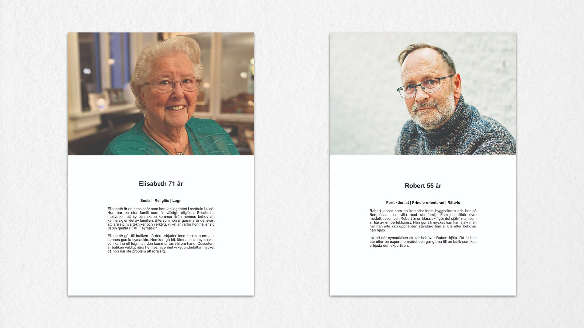
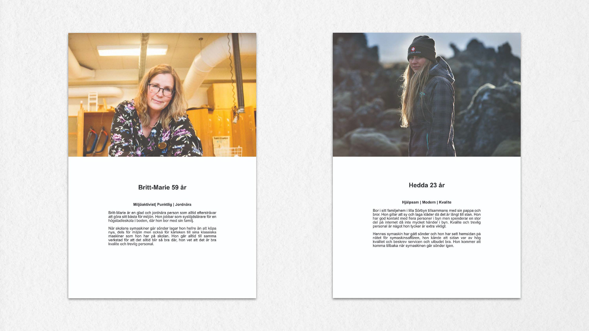
Today, the store specializes in the repair and sale of sewing machines, with a focus on the PFAFF and SINGER brands, without any digital marketing presence. The vision is to cater to older customers who may not be as tech-savvy and still want to rely on the store's services. Additionally, the aim is to attract younger individuals who are highly tech-savvy and familiar with the company, so they can seek assistance with their sewing machines as well.

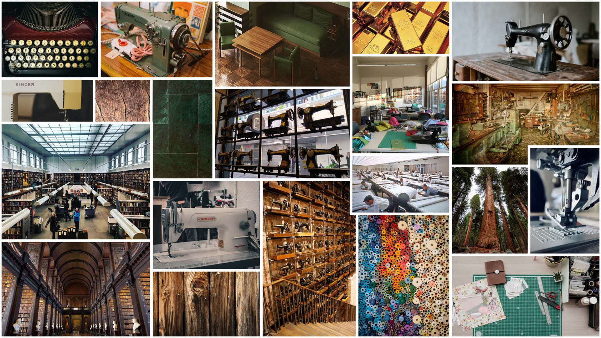
This 3D moodboard visualizes the feelings of Robust, Natural/Organic, and Historic. It also aims to convey a sense of Elegance, although it was challenging due to limited access to materials.
A styleboard that captures the store's aesthetic

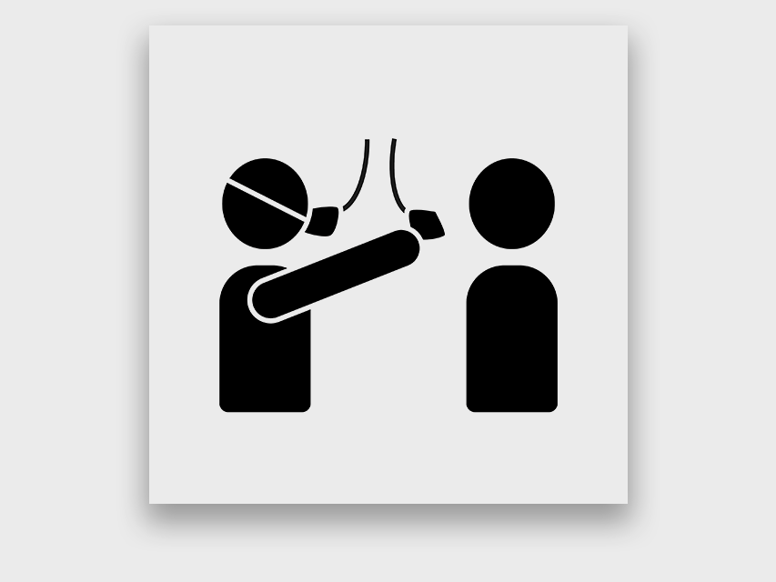
An imageboard showcasing the types of images to be used in the visual communication regarding the service
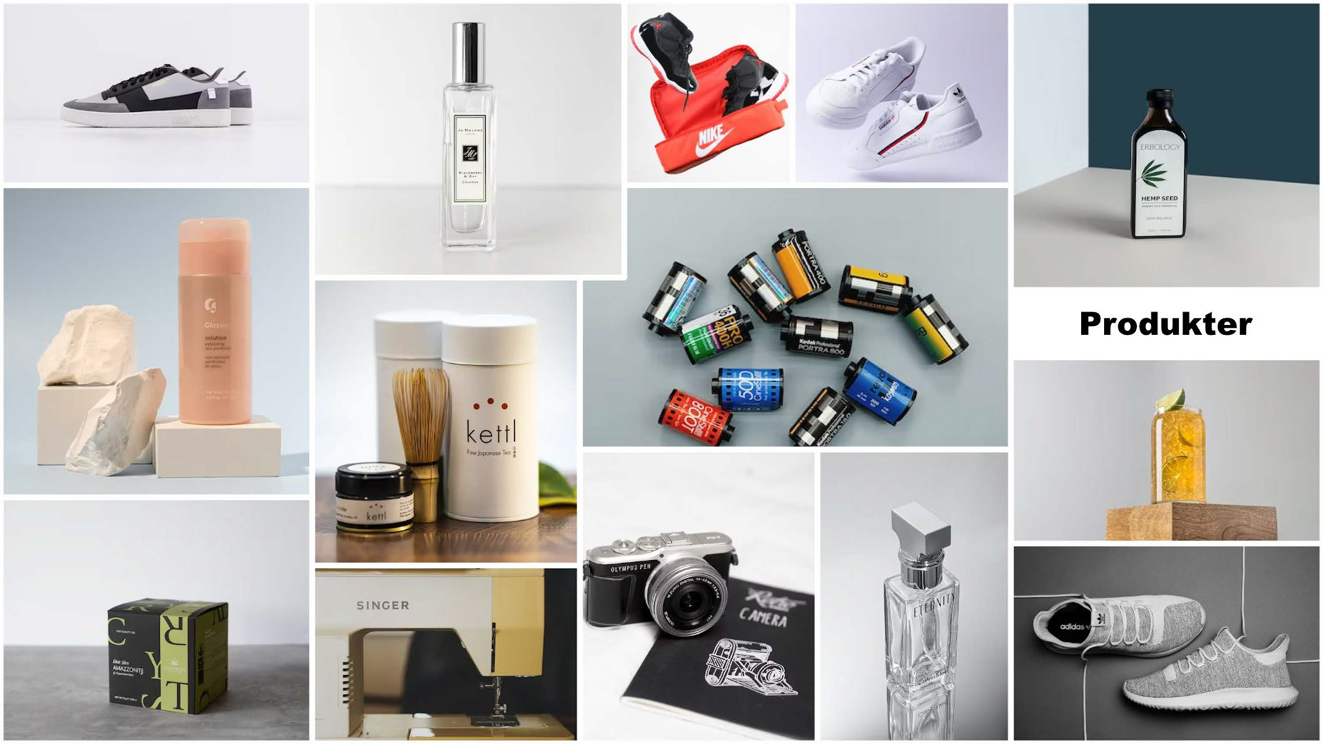
An imageboard illustrating the types of images to be used in the visual communication for product photography, such as for sales purposes on their new website.
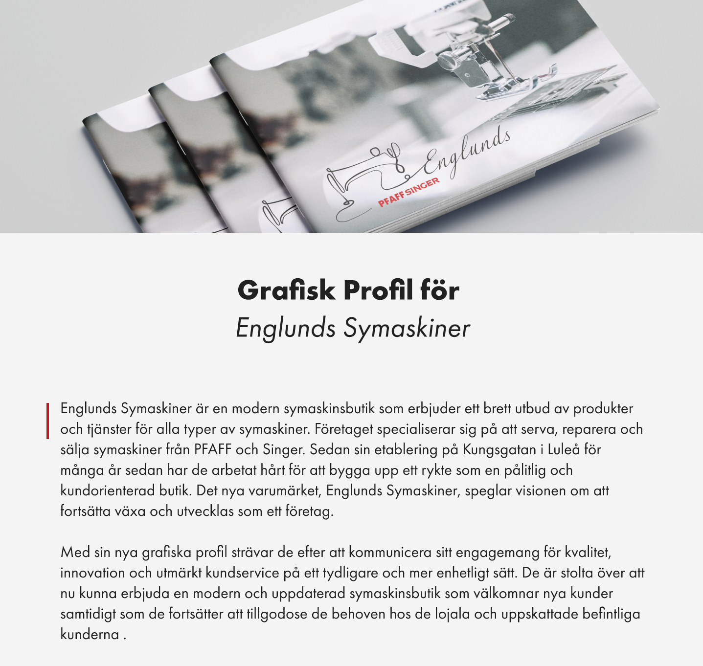
3 Graphic profile
Createing a comprehensive graphic identity that includes responsive logotypes, color schemes, typography, imagery and other graphic elements. Showcaseing applied design examples that demonstrate the implementation of the graphic identity.
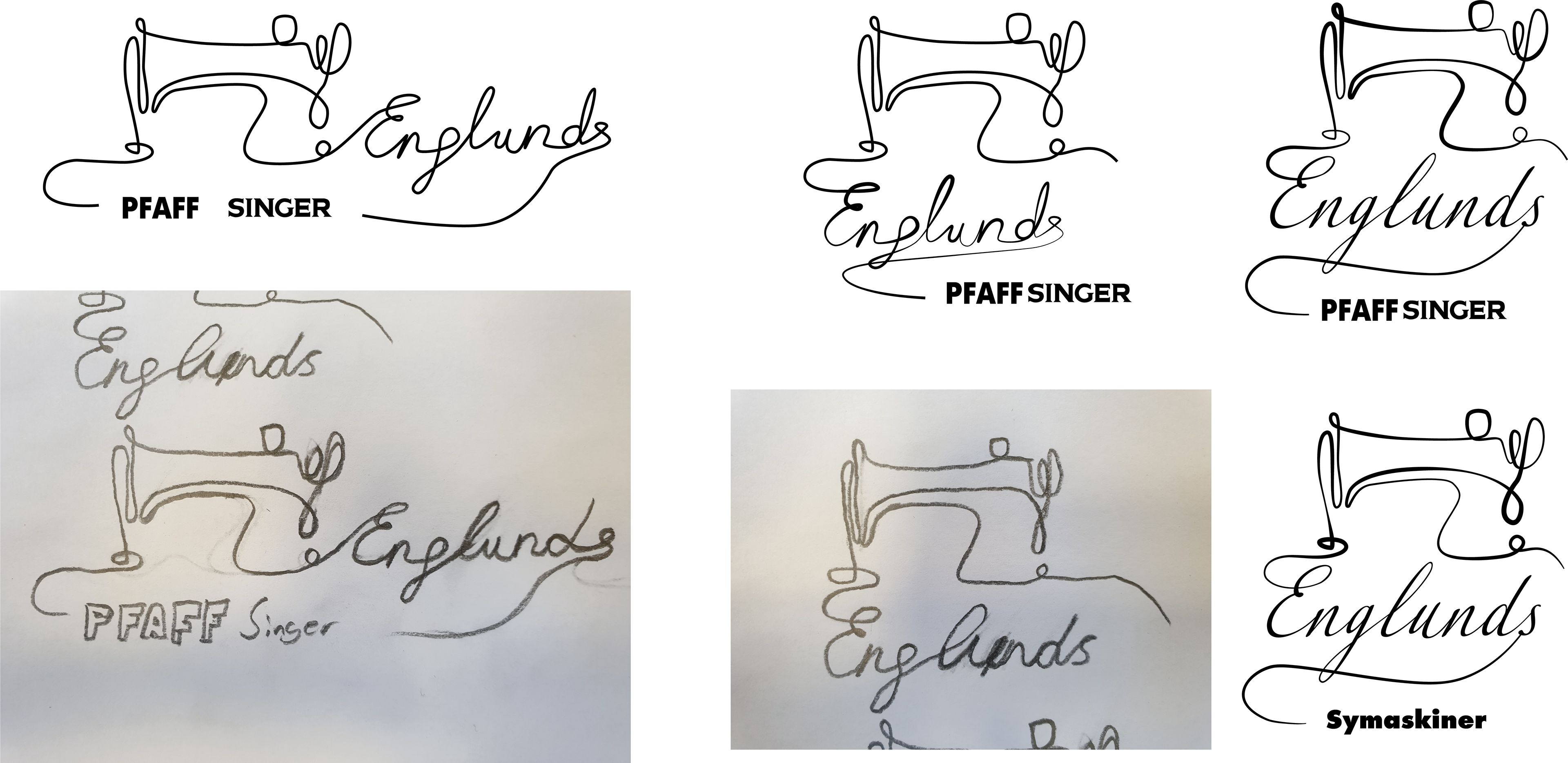
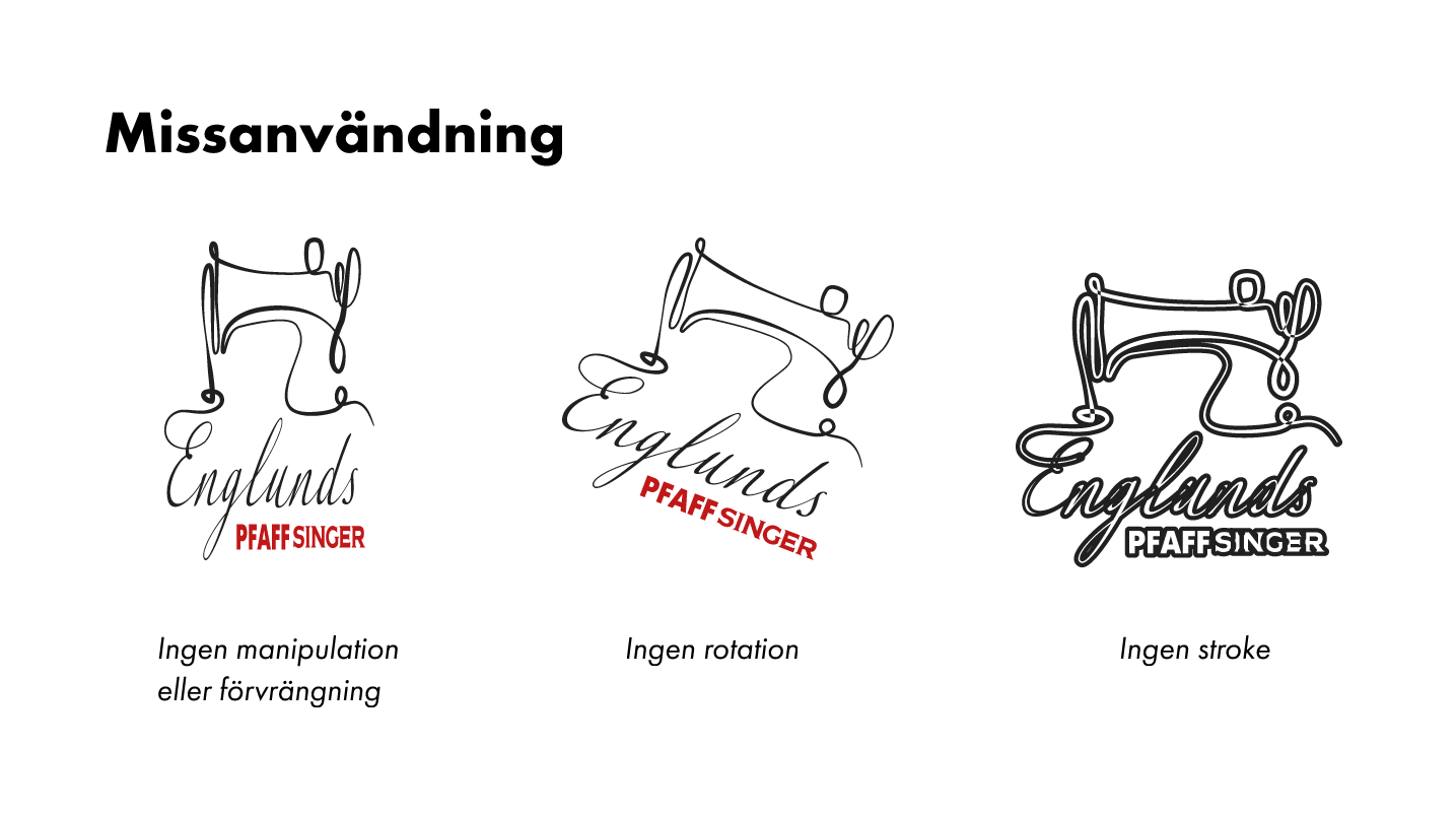
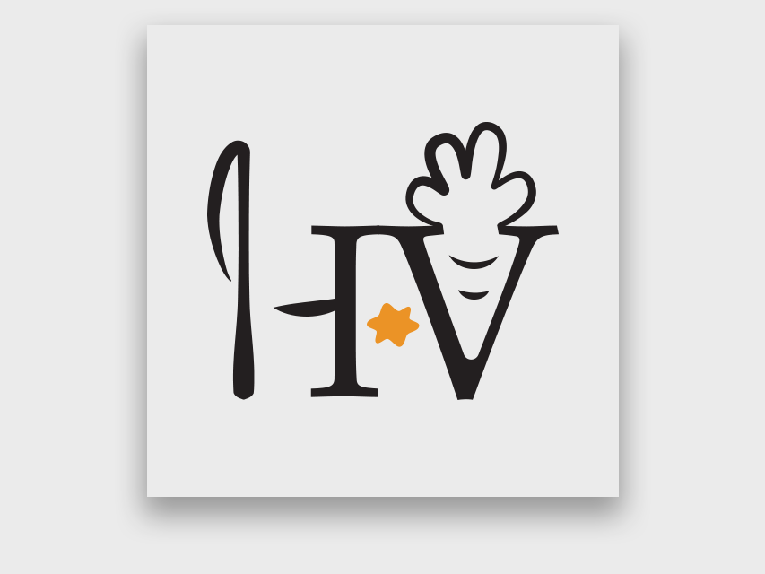
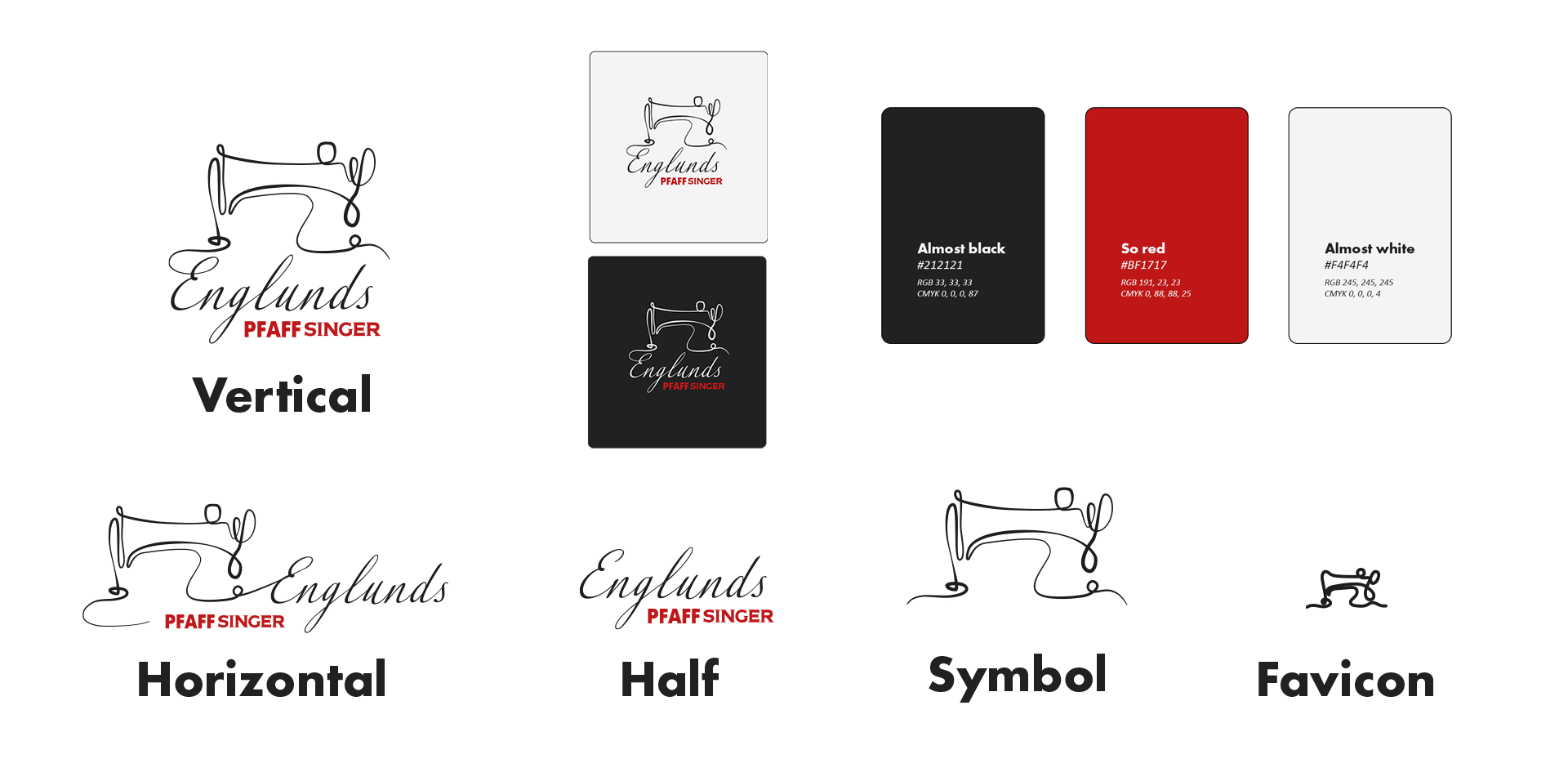
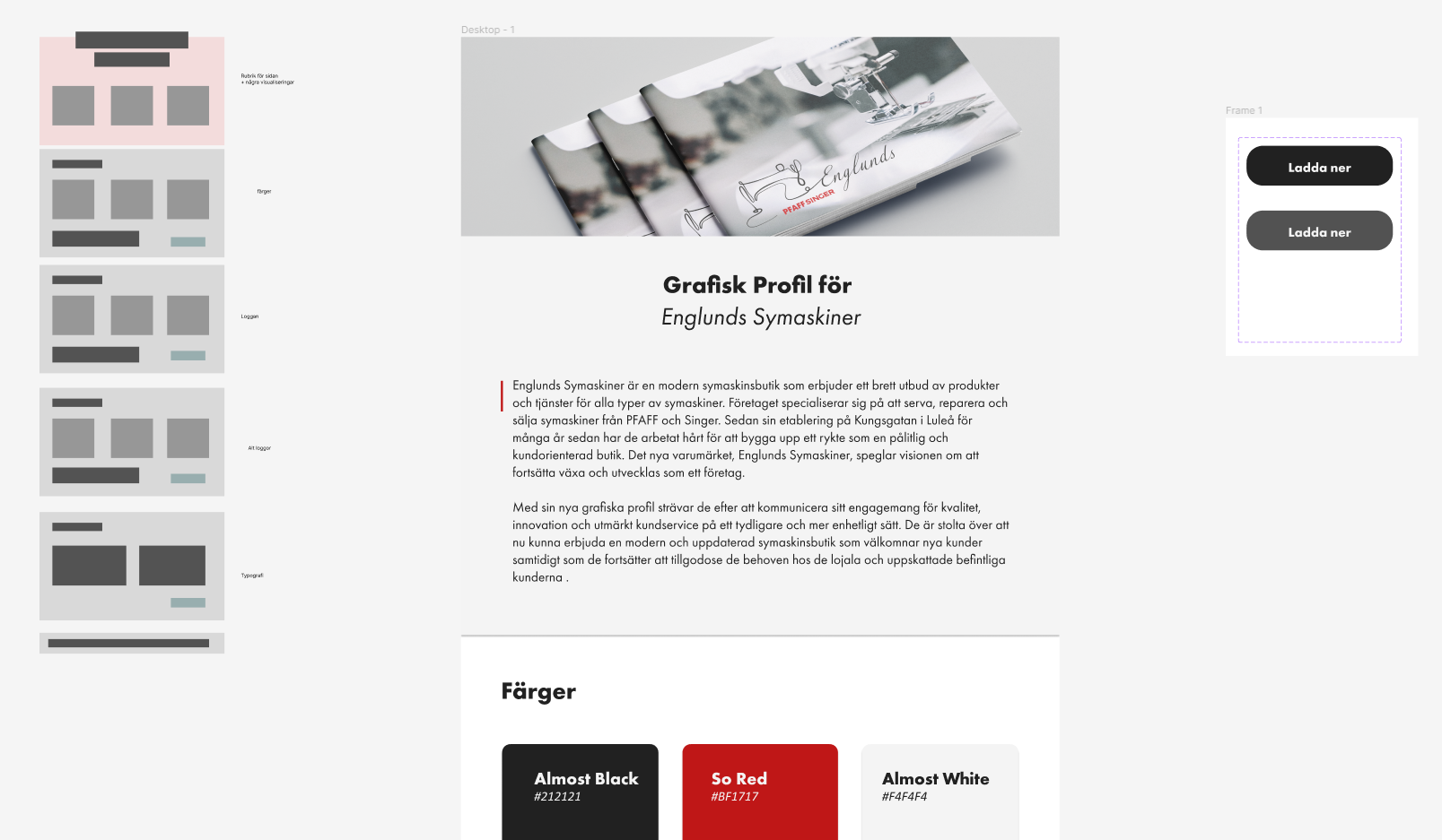
I began the development of the logo by looking for inspiration on a sewing machine that consisted of a single line. I sketched my own version and added the text Englunds and PFAFF SINGER. Initially the text was completely black but then I discussed the logo with another student and came to the conclusion that it would fit very nicely if the text PFAFF SINGER was in a red color as it was before. The result can be seen in the primary logo.
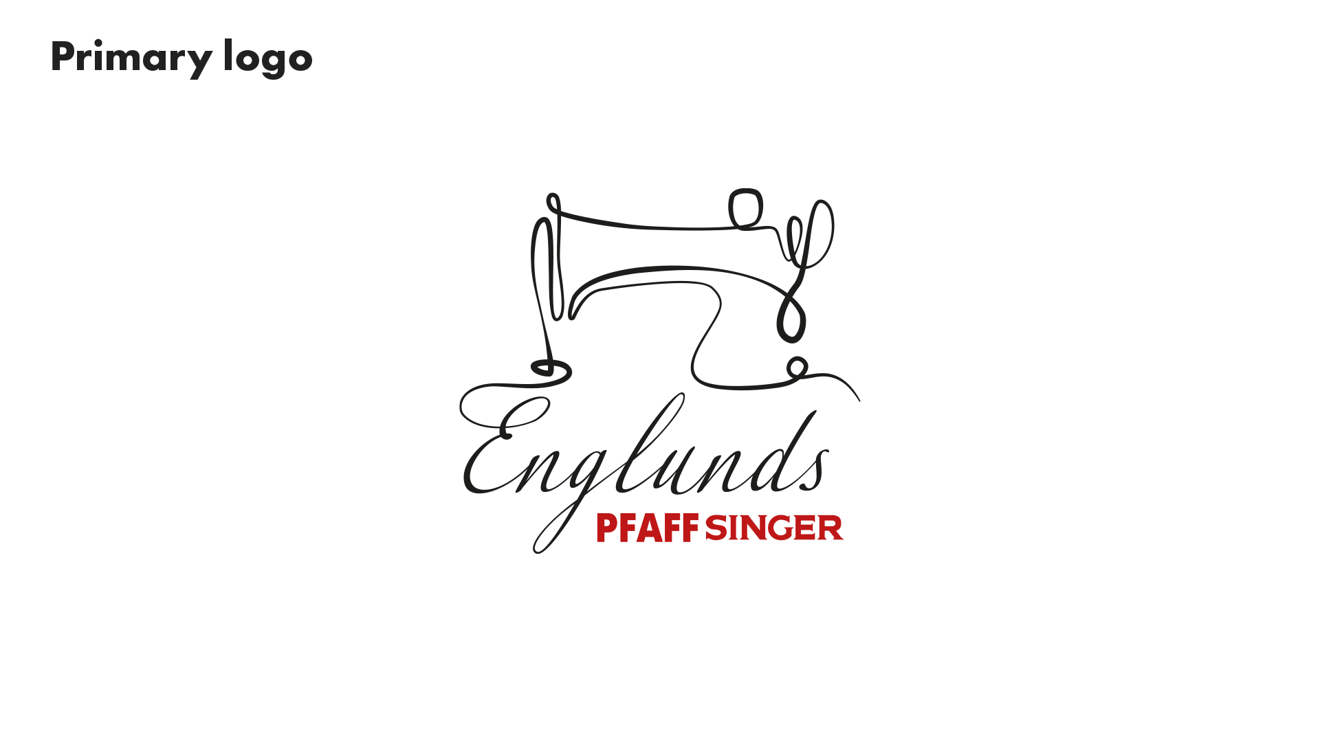

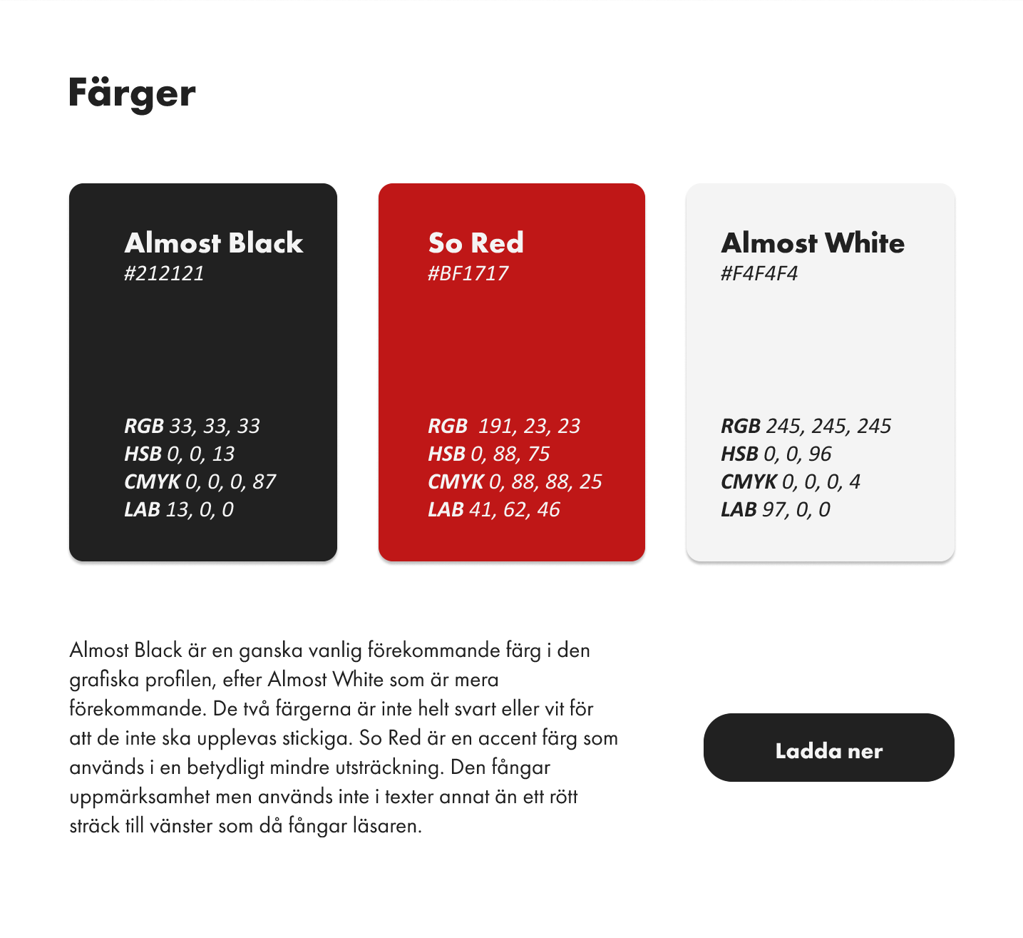
The red color makes the most important text, "PFAFF SINGER," stand out even more, emphasizing that these are the brands that the company specializes in. The color is visible and also complements both the lighter and darker logo variations effectively.
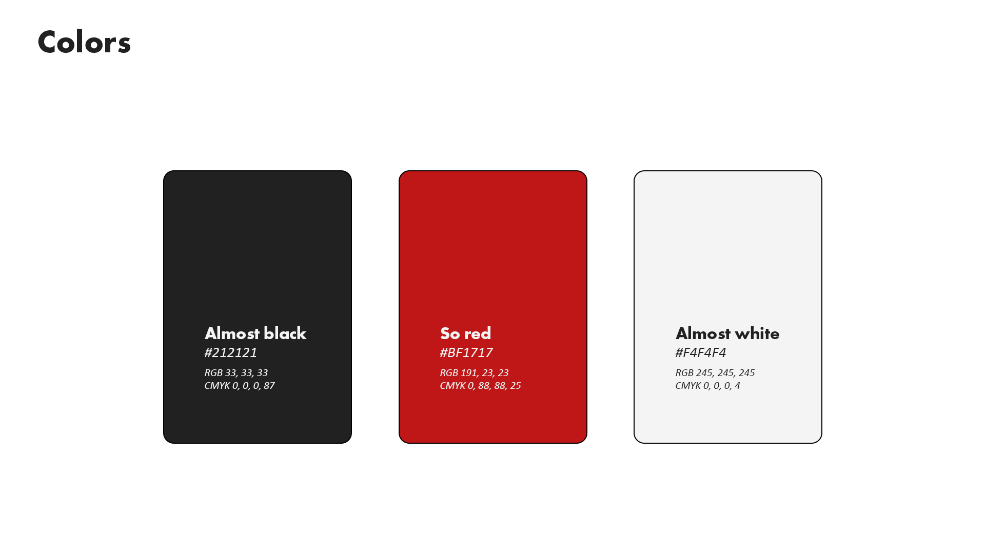
The colors I have chosen to use are a almost-black and white because they give a softer impression compared to when they are entirely black and white. I have decided to keep the red color from the company's previous graphic profile, using it more as an accent color that catches the observer's attention.

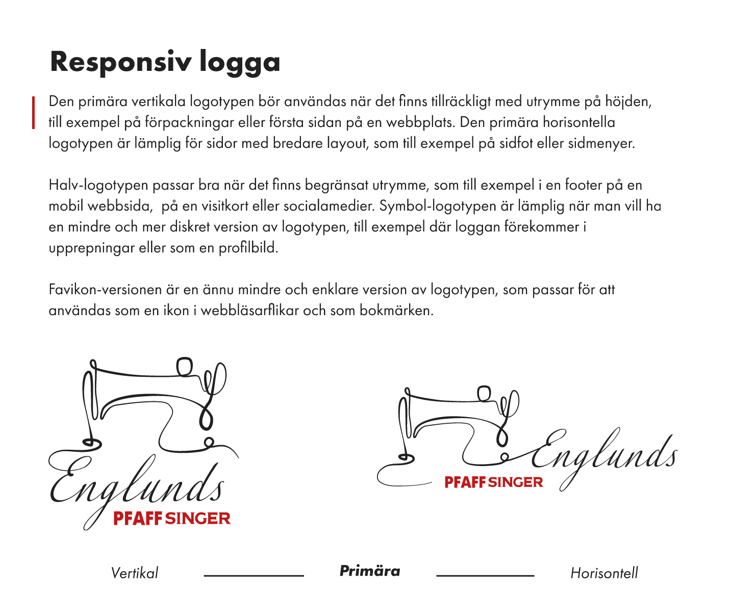
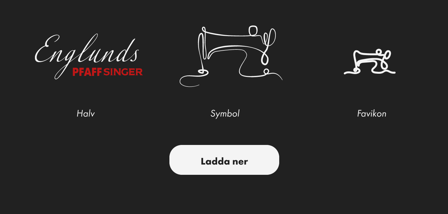
Based on the primary logo, several variations have been developed to suit various contexts, such as more horizontal spaces or smaller areas.
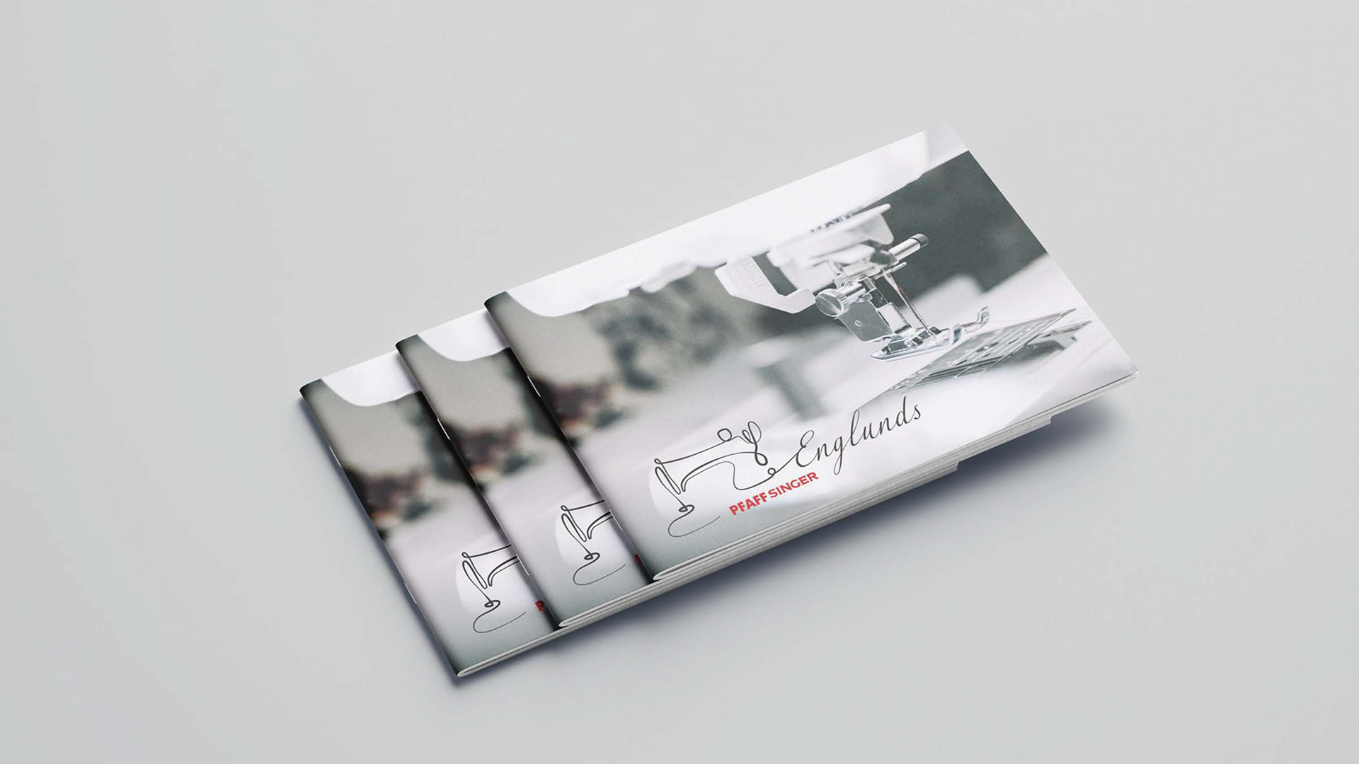
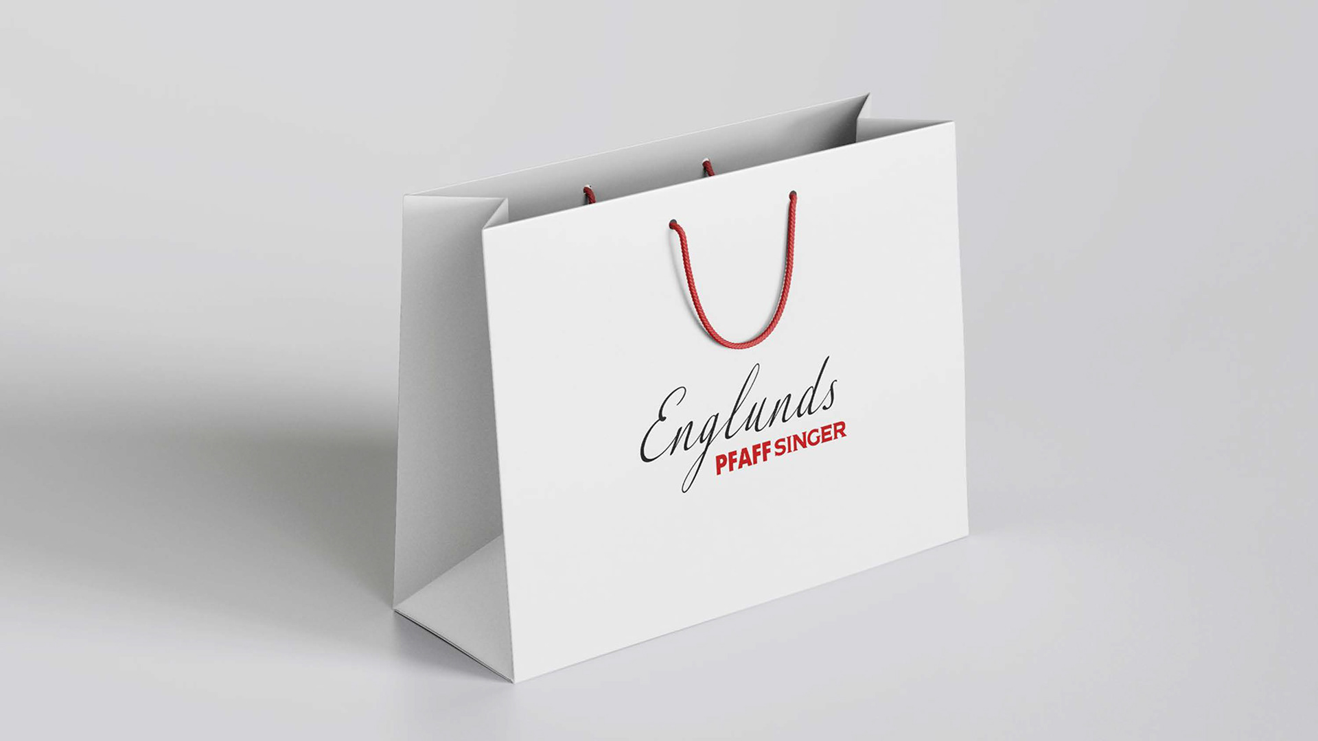
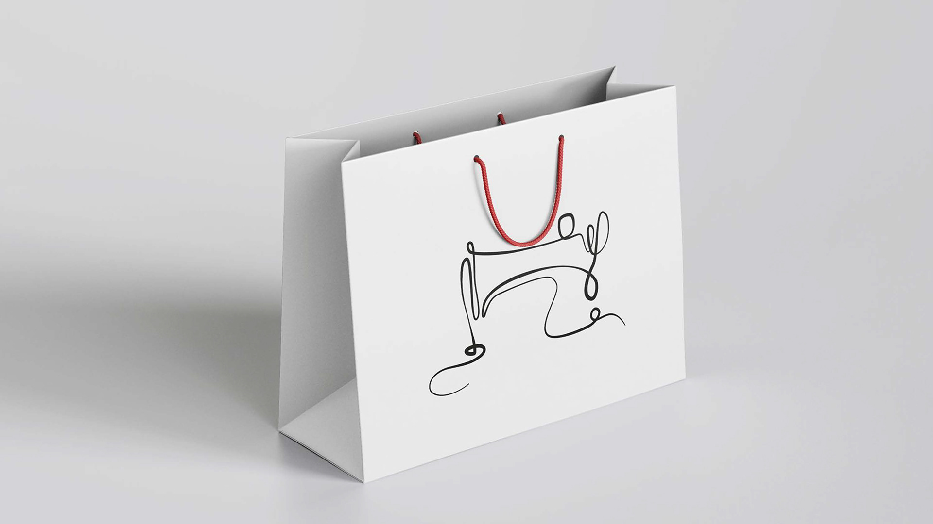

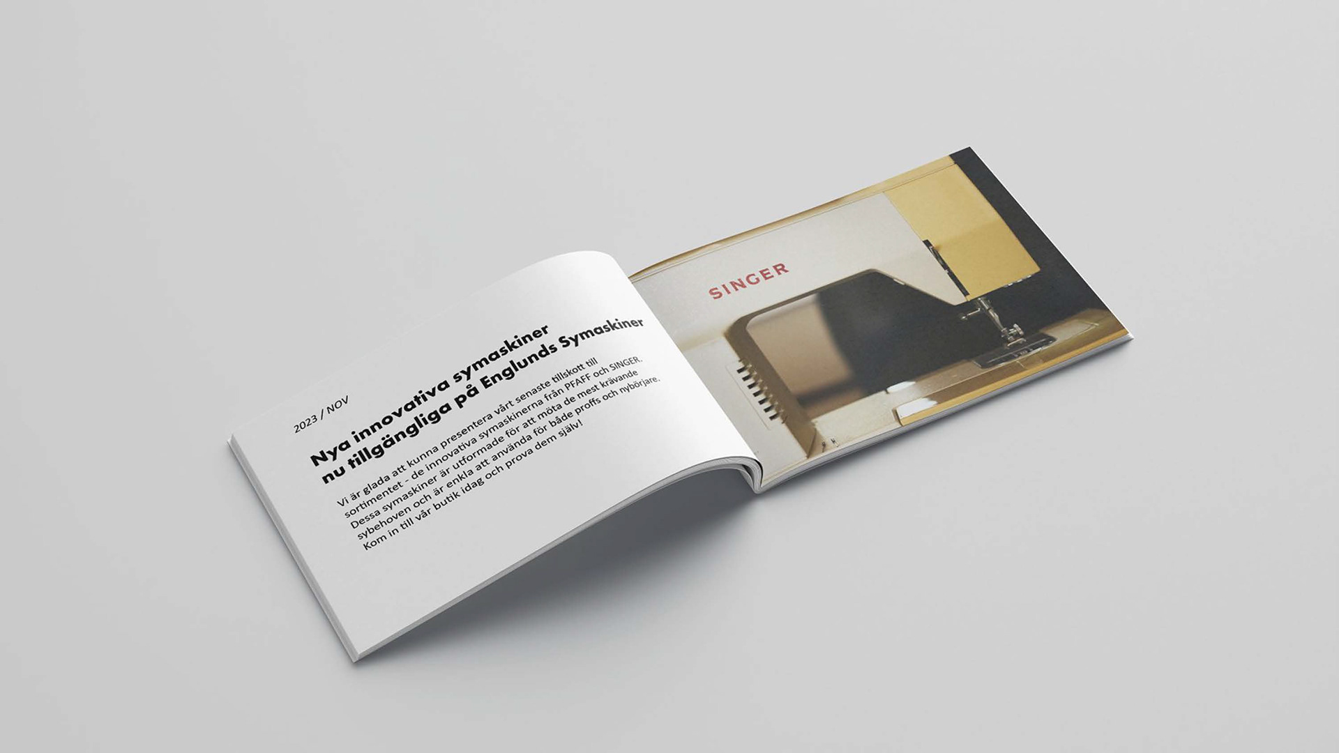
Here are some visualizations showcasing the different logos being used on a magazine and a shoppingbag.
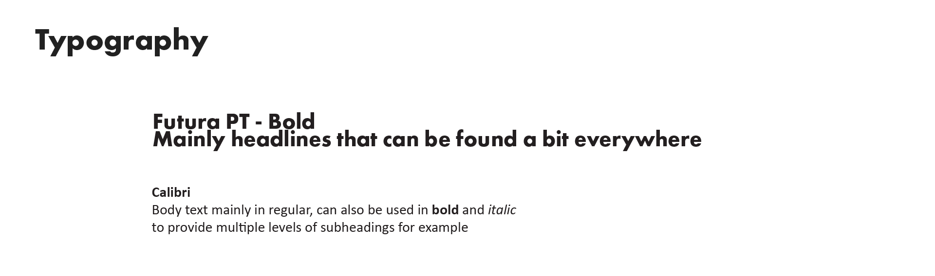
I chose Futura as the typeface because it is a sturdy font that instills a sense of security in the reader and also makes the company feel reliable and credible. For body text, I opted for Calibri as it is a simple typeface that complements the headings. Later on, the body text will also be changed to Futura to further unify the graphic profile.
Visualization of how the typefaces can be used in a magazine.
4 Sustainable packaging
Developing a package design that effectively communicates the graphic profile and aligns with the strategic design. The objective is to create a physical prototype that showcases the integration of your design elements.
I was looking online for inspiration and finally found a box with a lid that went very deep which I thought was neat. I wanted the lower part that would be visible in a black color to match the graphic profile and not be too white. At the university, there is a laser cutter that easily can cut out the parts that make up the box. I then looked for a template similar to the box I wanted to make and created a cut path using Illustrator. I later added some half circles to make it easier to lift the lid.
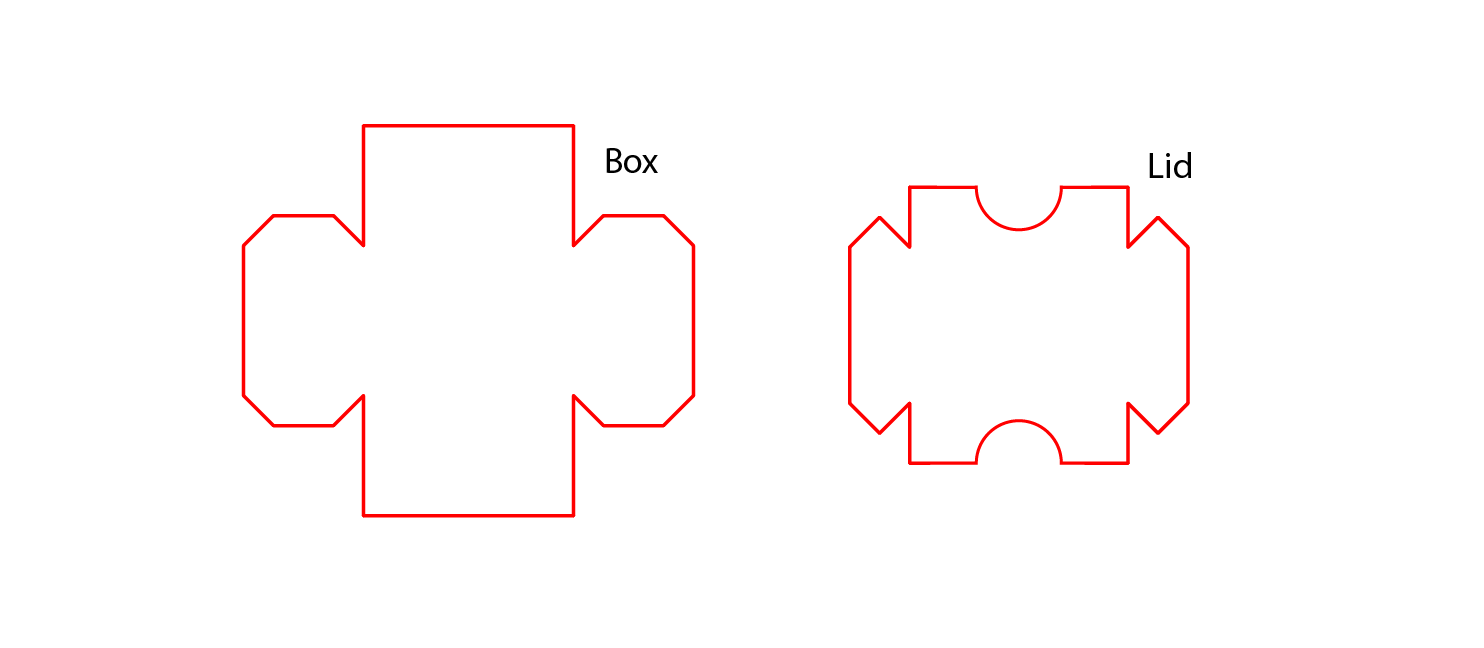
Cut path for the laser cutter

A sustainable packaging made from recycled black and white cardboard. To hold the box and the label together, environmentally friendly glue and paint are used for the label. The package has a more value as the idea is that you can take the box with you to the store and fill the box with needles. The printed image shows what the box is supposed to contain instead of using a plastic film as a window.
5 Graphic manual
Create a contemporary and interactive graphic manual for your identity, designed as a responsive webpage that works across devices. Reflecting your graphic profile, the manual should guide users on how to apply the rules for the logotype, colors, typography, imagery, and other graphic elements.
From the previous graphic profile, I changed, among other things, the font used in information text from Calibri to Futura to give an increased cohesion. To bring in the red color even more, I added a red vertical line to the side of the text that gives a clear starting point.
To create the interactive website, I used Figma, which I have used in previous projects.
Link to the interactive graphic manual: Here and a preview further down.