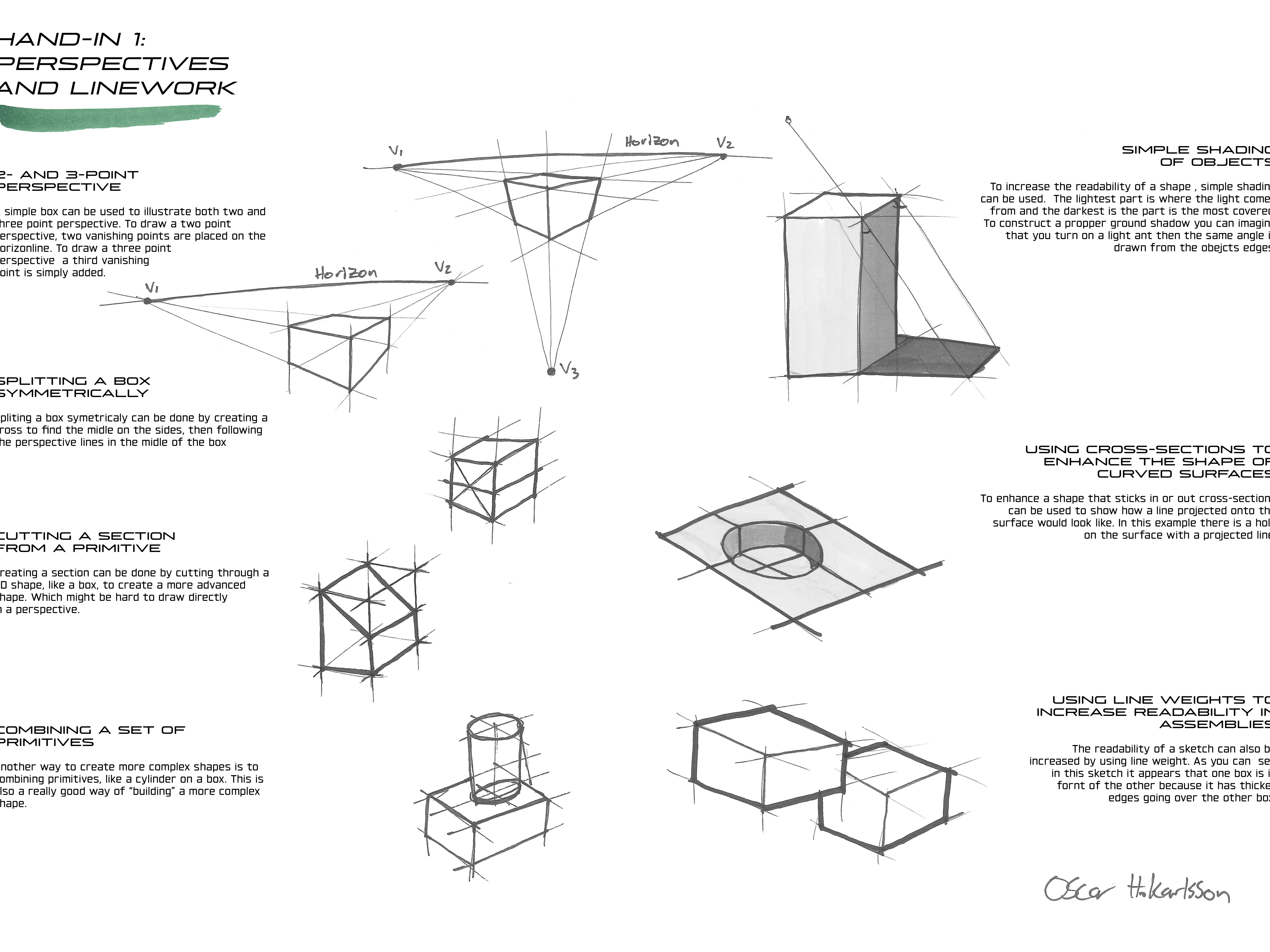
In this project I learnt to use a graphic manual from another student (David Simonic) and to make a poster from it. The goal was to share and exchange graphic manuals with another student for testing and then design an A4 poster for a design exhibition, following the instructions in the provided manual.
Typography and imagery in the poster

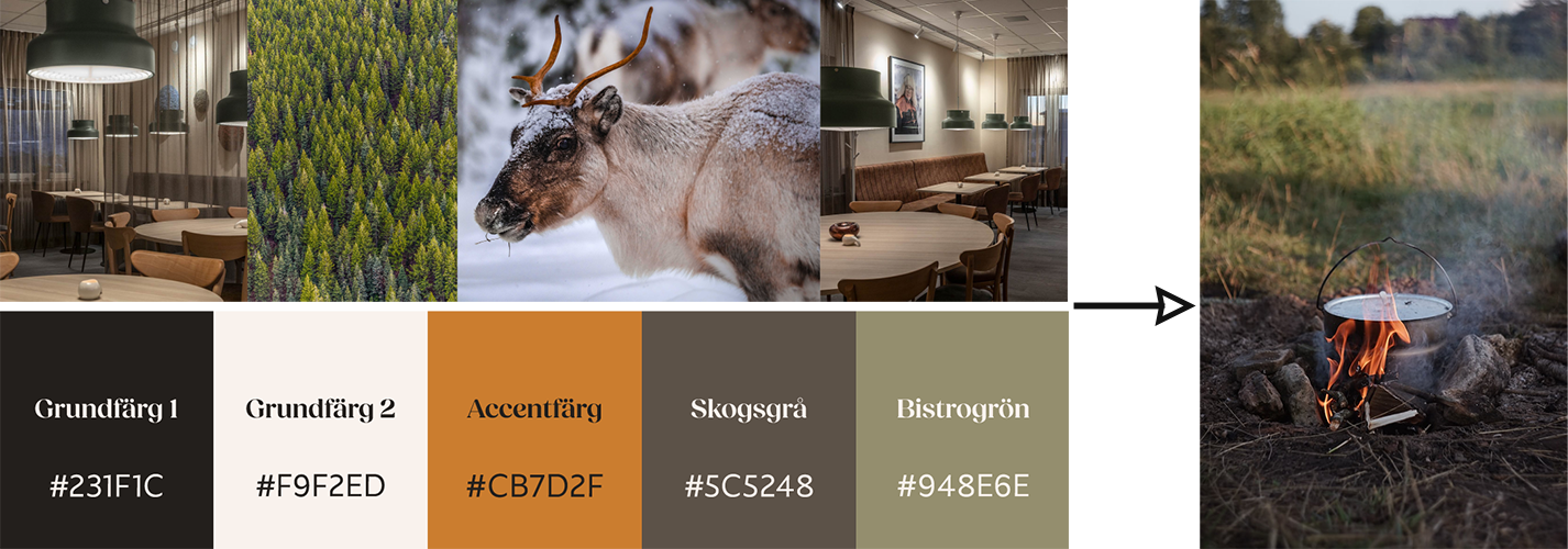
Excerpt from assigned graphic profile
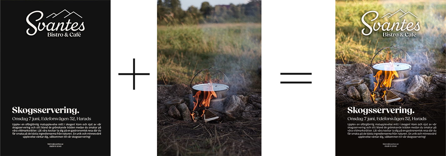
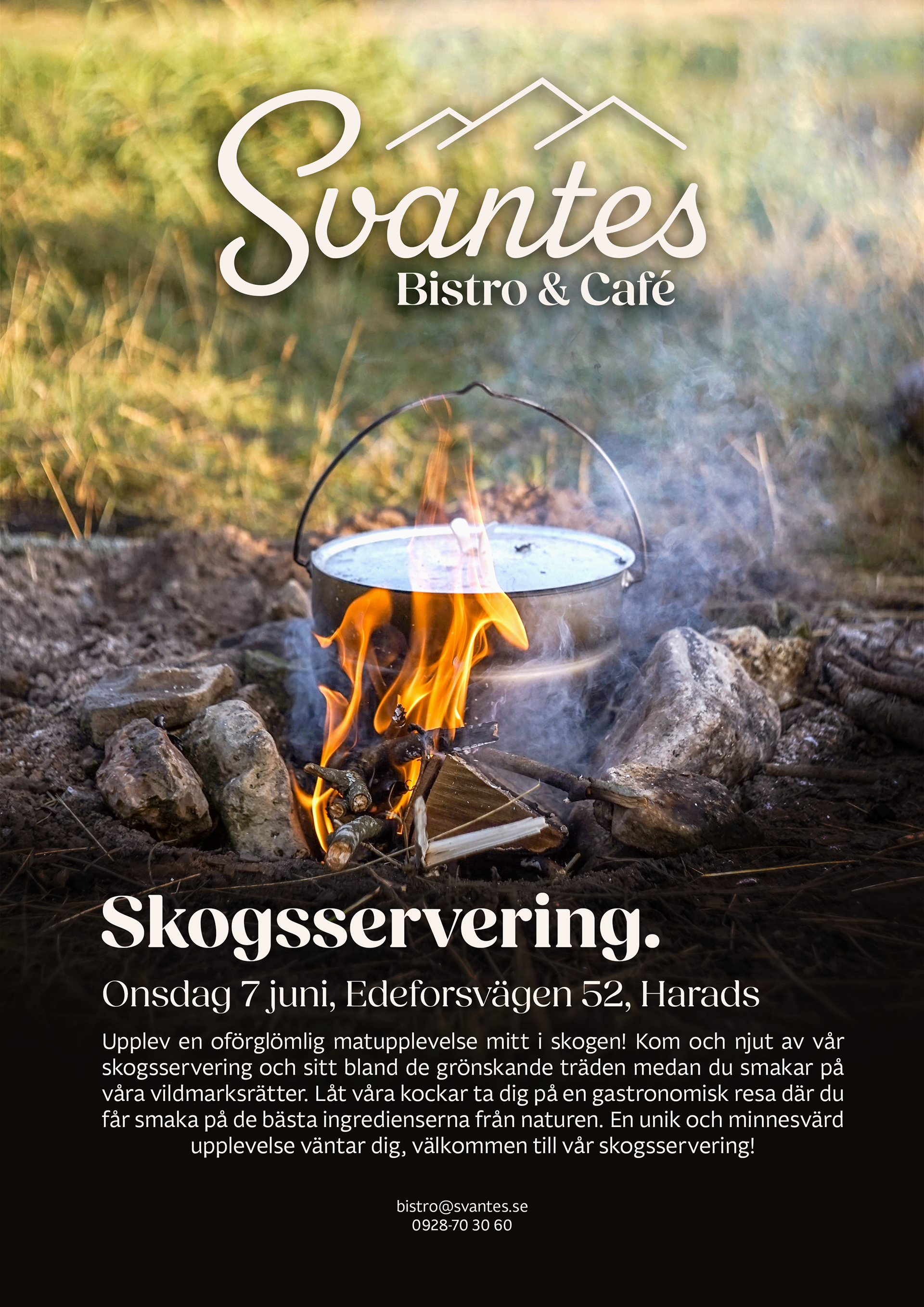
From these layout examples I took inspiration for the placement of the logo at the top of the middle, the position of the heading and the location of the information text. However, I made some changes by adding a subheading for the date and the address to make it stand out more from the rest of the text. I adjusted the information text to fully justify so that the poster would be perceived as more symmetrical.
I chose the picture with the storm kitchen because it had many of the colors included in Svante's graphic manual. Behind the text I added a dark gradient to make the text easier to read and because the image was a bit too small.
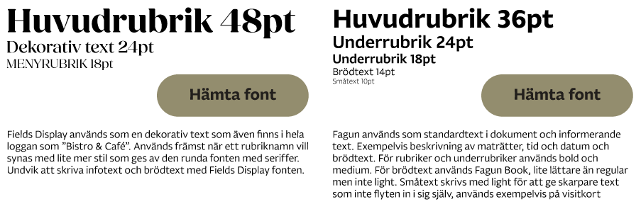
I think the fonts used in the graphic profile suit the company very well. I used these in the poster, but in the manual it was a little unclear which font in the family to use, so I had to take a chance on that. I had made it so that instead of "Huvudrubrik" it says "Huvudrubrik - Fields Display Bold" to facilitate which font is used.
Overall, I think it was a very nice graphic profile with many rules and guidelines, however, there were a few things that were missing that were also missing in the graphic profile that I made. I think it was fun to work with someone else's graphic profile because then you had to think a little about what was not there to find loopholes. It also made me come up with lots of rules that I didn't write in the graphic manual I made.
Link the the graphic manual i got to follow: Here